nonprofit and foundation websites
Description
As the sole designer, I oversee every facet of the design process, collaborating closely with the two developers on our team. My involvement spans from initial client meetings through the creation of high-fidelity mockups to the seamless execution and launch of the websites.
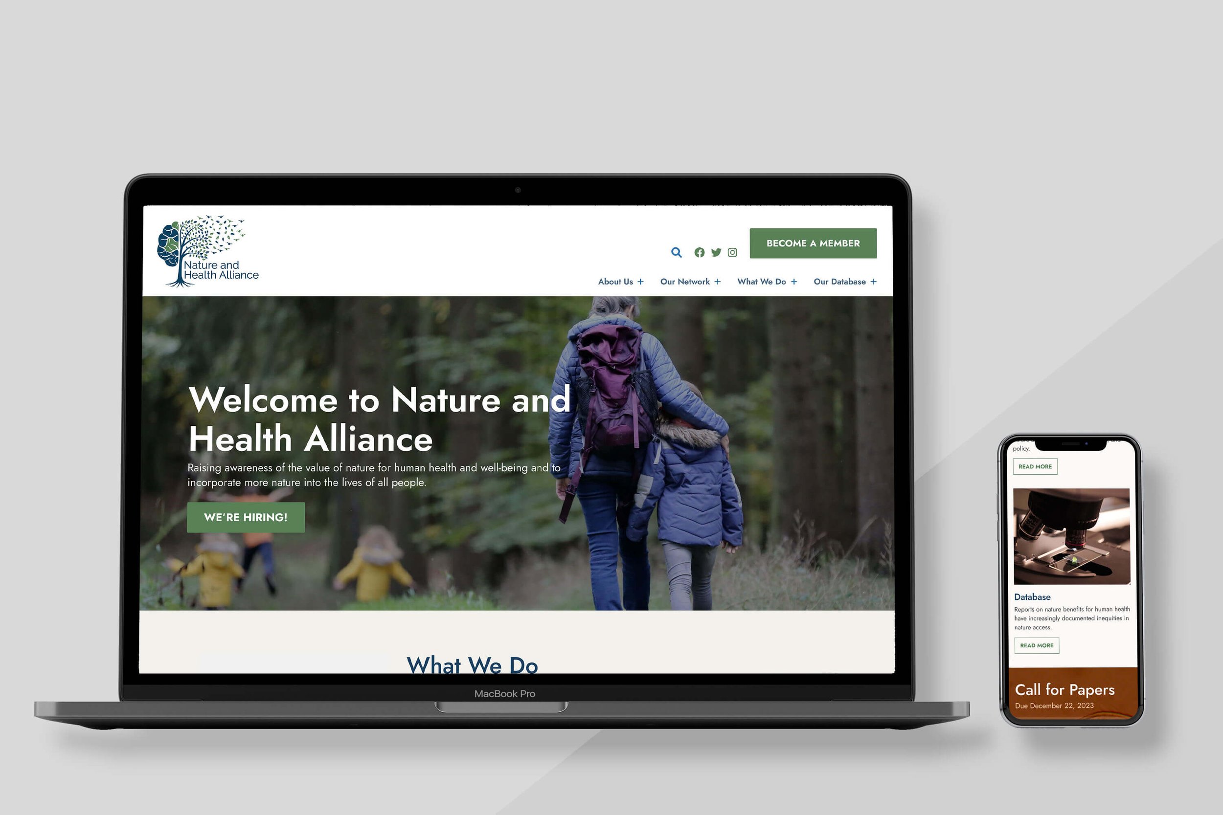
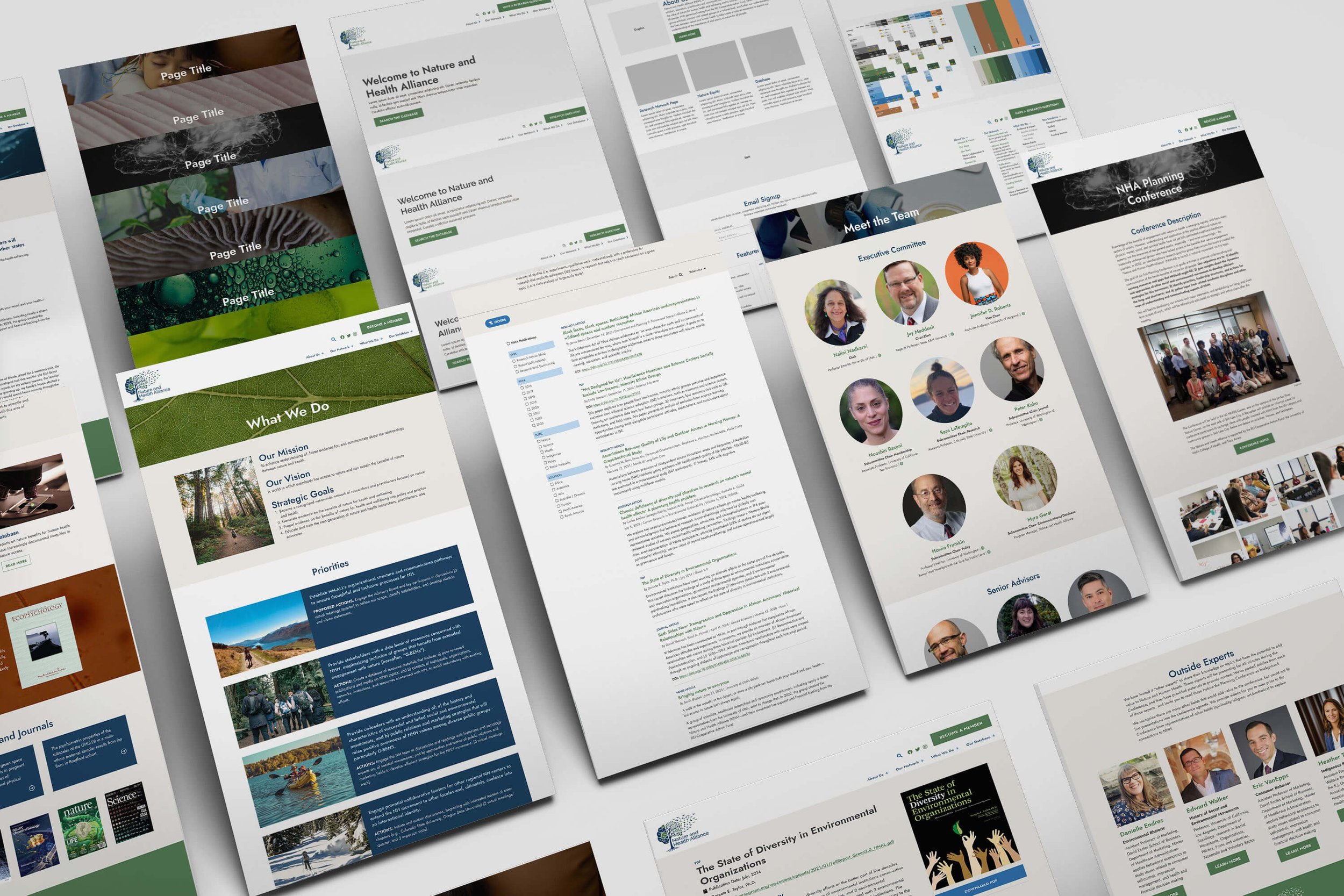
Nature and Health Alliance
Nature and Health Alliance is a network of dedicated researchers and practitioners committed to the intersection of nature and health, with a mission to educate and train the next generation of nature and health researchers, practitioners, and advocates.
Work Produced: Branding and complete website build
Problem: The client, a recently established organization, required the development of a central hub dedicated to facilitating researchers in disseminating information on the health benefits of nature.
Solution: Designed an aesthetically pleasing website featuring intuitive user pathways tailored for various audience segments. Implemented a user-friendly, centralized database housing peer-reviewed articles alongside concise research briefs, ensuring ease of navigation and information retrieval.
Audience: Scientists, policy makers, and advocates
Concept: Science and nature | connections/friendly
Typeface Used: Jost
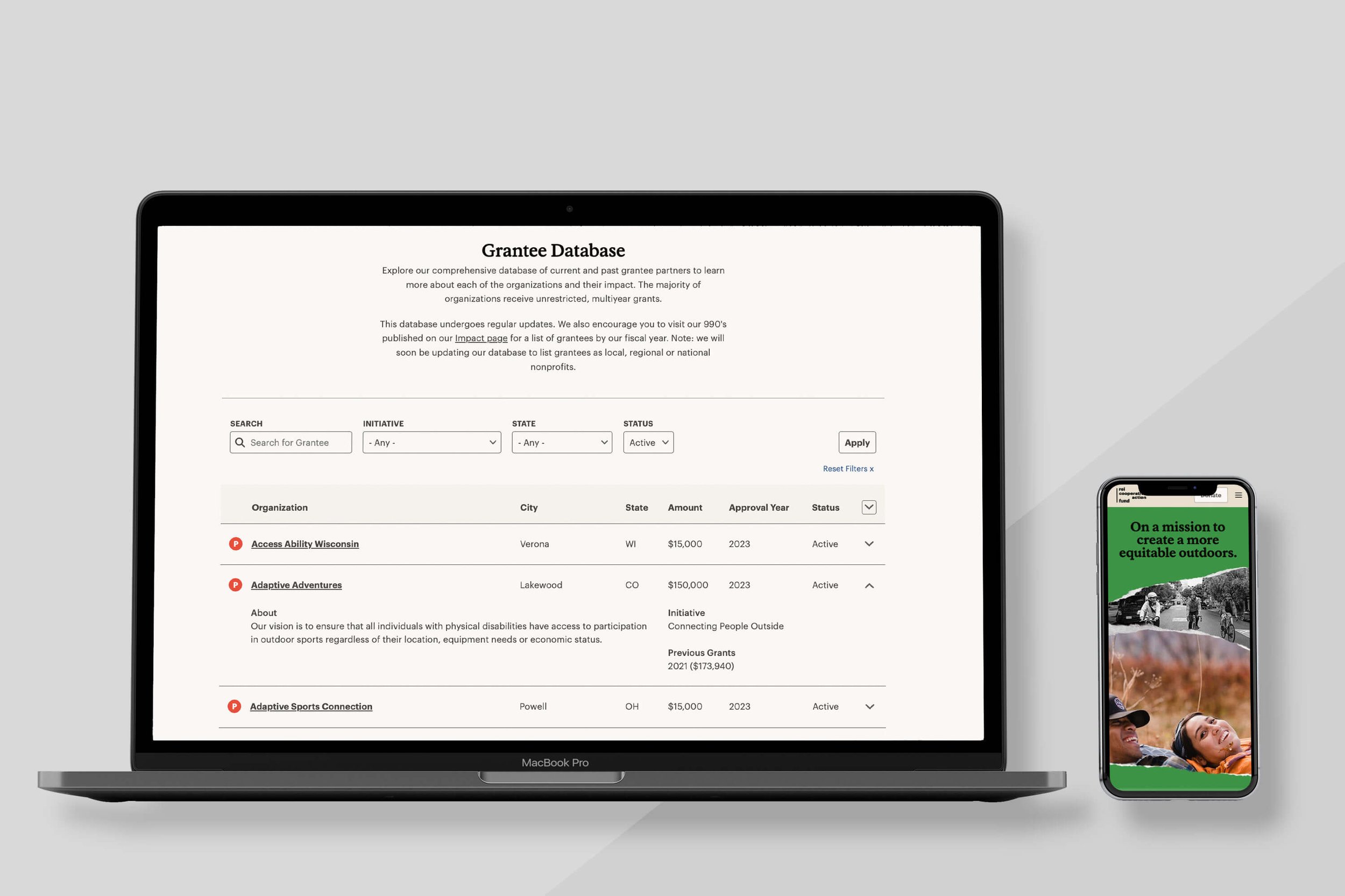
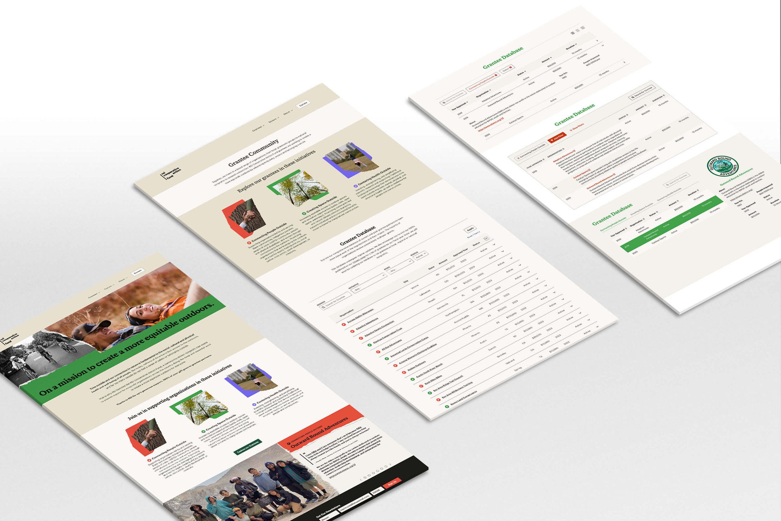
REI Cooperative Action Fund
The mission of the REI Cooperative Action Fund is to create a more equitable outdoors by bringing together the collective strength of our community.
Work Produced: Database and homepage refresh
Problem: The client recently initiated a fall campaign wherein local co-ops participate in nominating and selecting grant recipients supported by the Fund. The initial phase aimed to onboard 300 new grantees, with plans for further expansion. The challenge was to create a display mechanism that effectively showcased the tenfold increase in grantees and facilitated easy additions to accommodate the growing numbers. All efforts needed to align with the established brand guidelines.
Solution: Established a transparent and easily searchable database to foster community engagement. Implemented a dynamic slideshow feature to highlight specific grantees, enhancing visibility and recognition within the community.
Audience: REI co-op employees and clientele
Concept: n/a
Typefaces Used: REI Stuart and Graphik
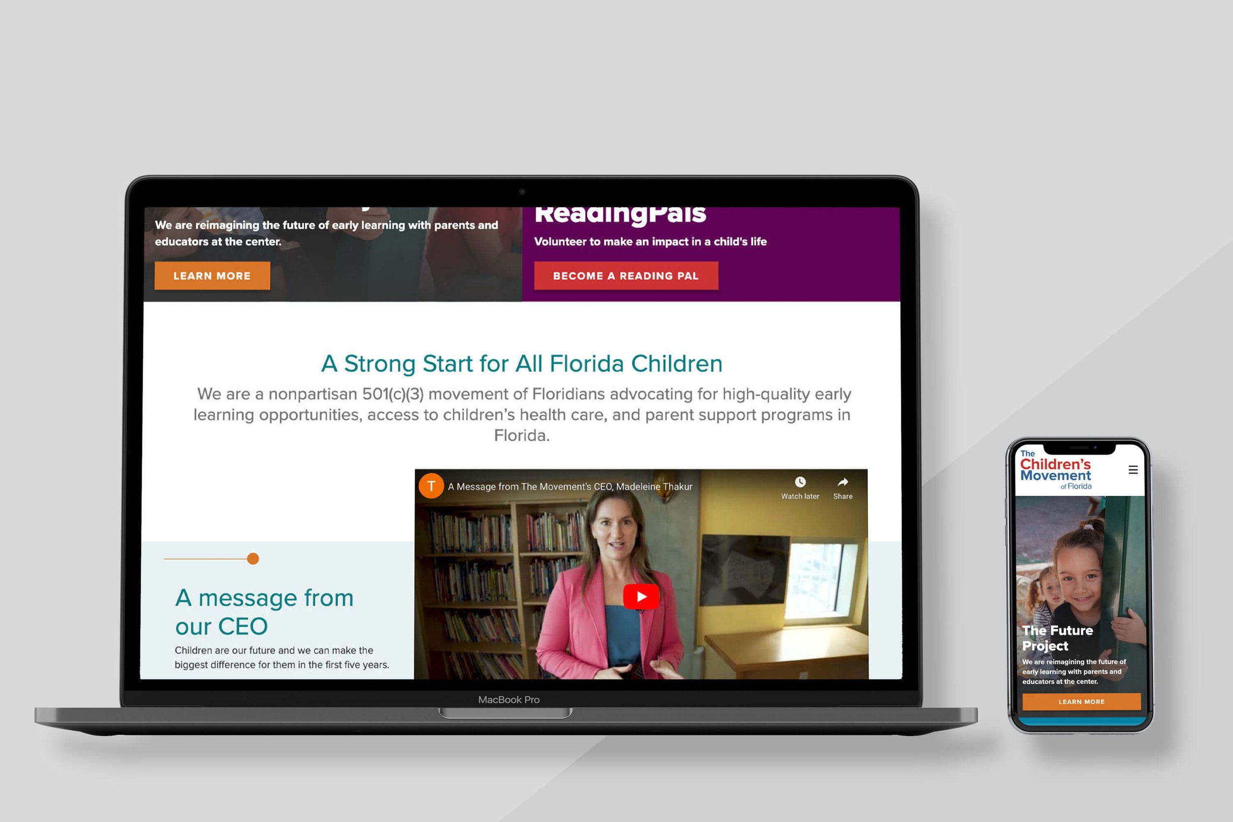
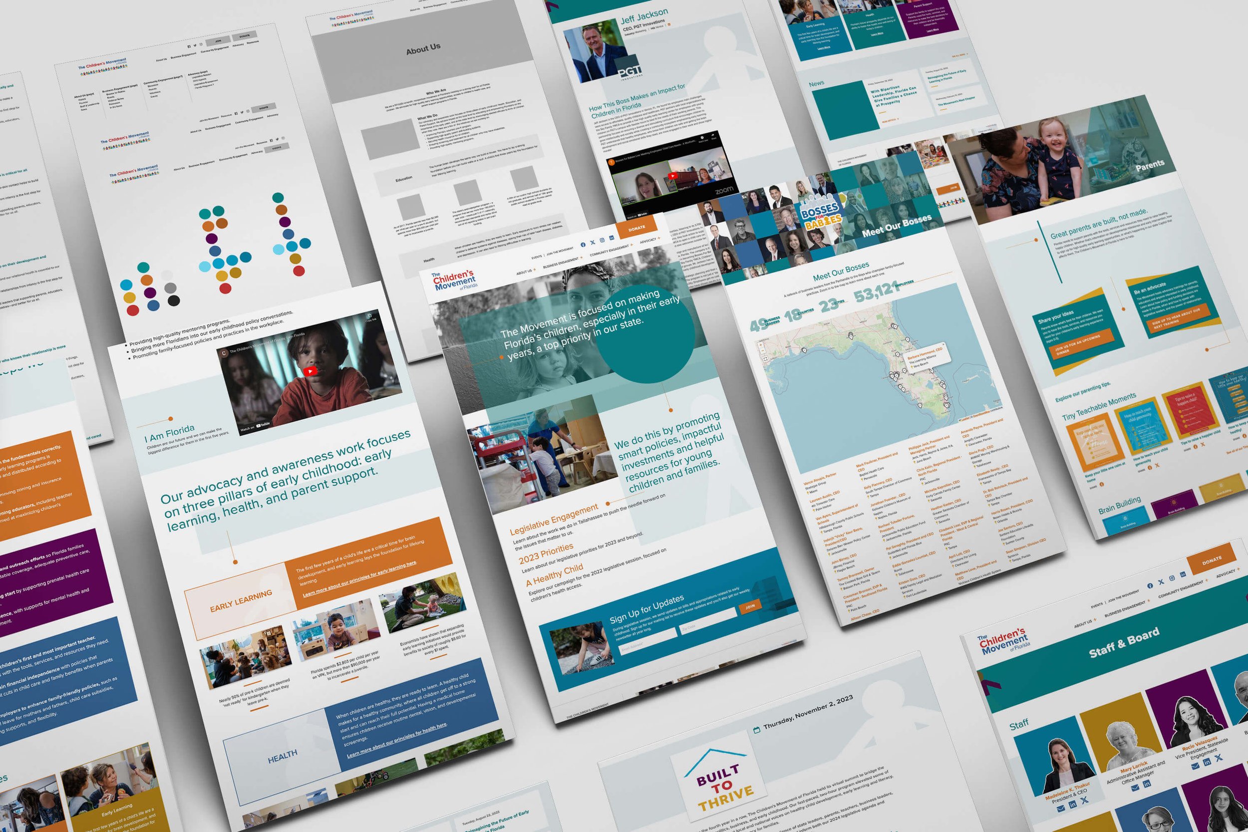
The Children’s Movement of Florida
The Children’s Movement of Florida is a nonprofit, nonpartisan movement of Floridians insisting on a strong start for all Florida children, with advocacy and awareness work focusing on three pillars of early childhood: early learning, health, and parent support.
Work Produced: Branding refresh, website rebuild, various print work
Problem: The client sought a restructuring of their website, expressing dissatisfaction with the current state where information felt disorganized and crammed in. Their specific goals included revamping site navigation for better organization, incorporating interactivity into the historical content, and achieving a brighter and more engaging overall site design.
Solution: Revamped user pathways and crafted a contemporary website design. Enhanced accessibility by updating existing colors and introducing additional hues. Infused a friendlier yet trustworthy vibe by refreshing the font.
Audience: Individuals and advocates wanting to make a change at the legislative level for children in Florida
Concept: Guided/expanding from point, pebble effect
Typeface Used: Proxima Nova
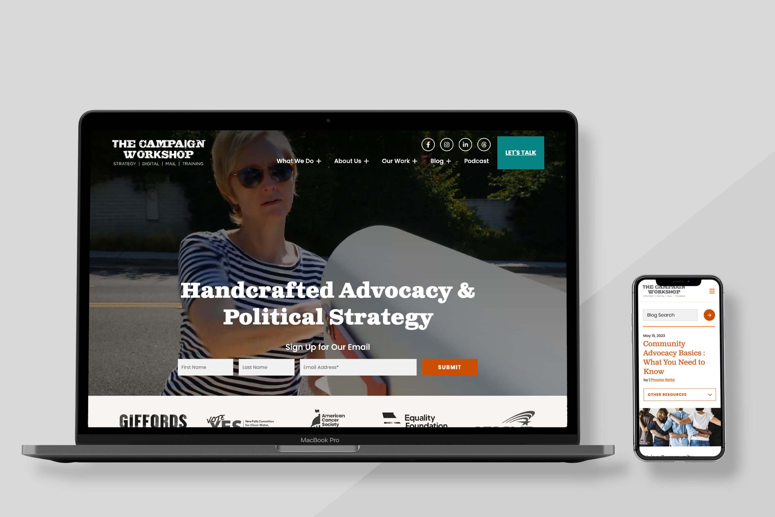
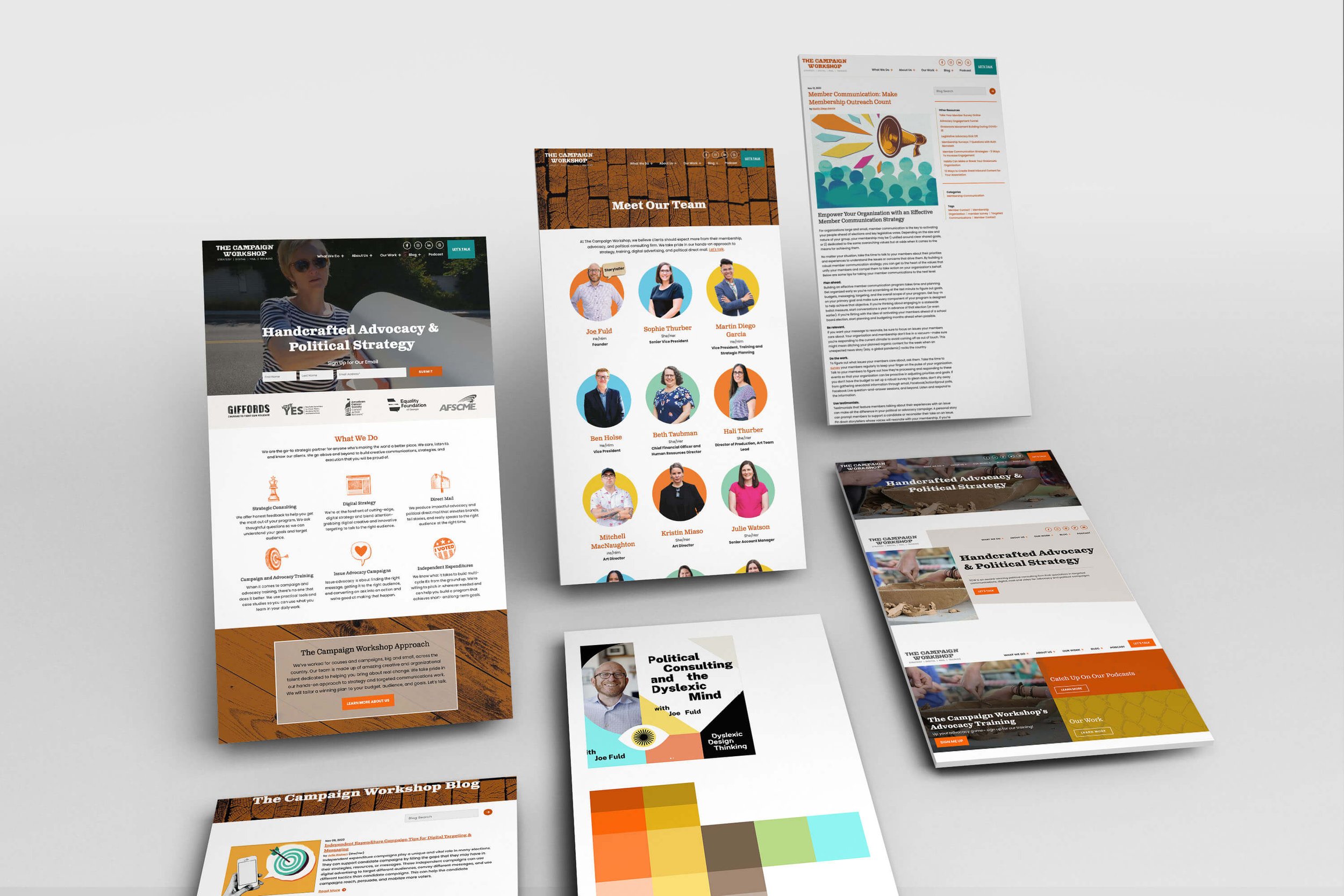
The Campaign Workshop
The Campaign Workshop is an advocacy and nonprofit consulting firm that create solutions for strategy, training, digital advertising, and political direct mail.
Work Produced: Website design refresh
Problem: The client conveyed dissatisfaction with the current website, citing there was too much going on and that there was too heavy of a wood look. They expressed concerns about disorganization and a lack of clarity regarding their services. In their own words, they emphasized the need to "fix the paint on the house, but not tear down the walls."
Solution: Enhanced user pathways and cultivated a lighter ambiance for the site. Maintained the original fonts and colors, but slightly adjusted colors to be accessible. Introduced a search function to the blog and implemented a feature to spotlight specific blog posts.
Audience: Users in the nonprofit space looking for digital and print advertising, direct mail, trainings, and strategic advice
Concept: n/a
Typefaces Used: Clarendon and Poppins
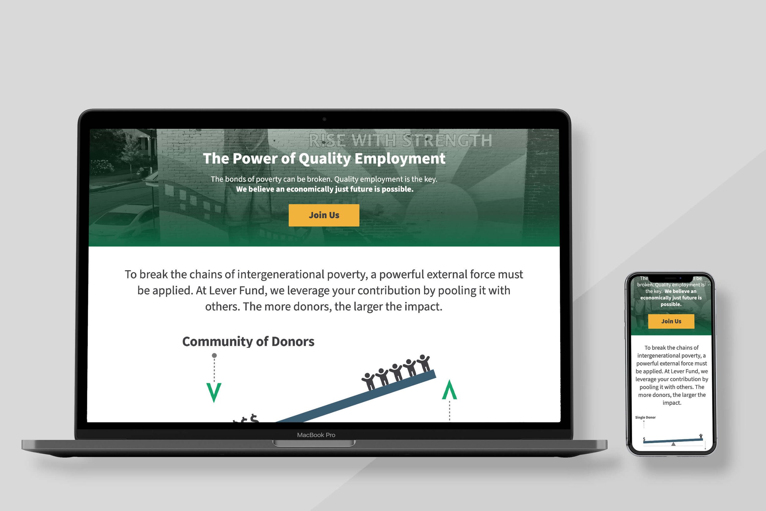
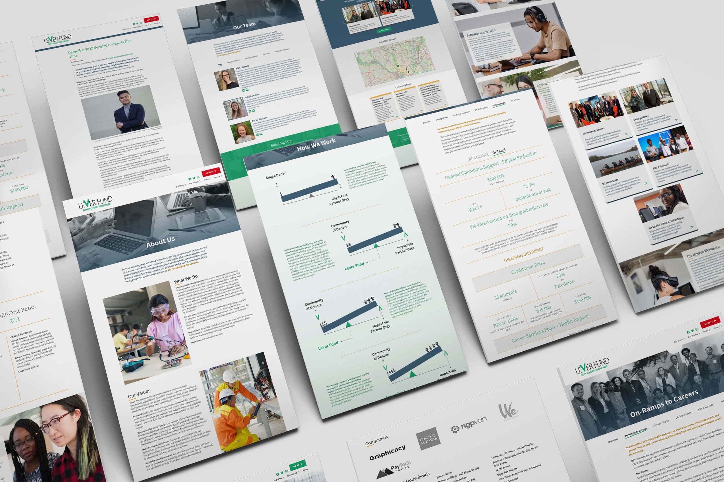
Lever Fund
Lever Fund supports programs and initiatives that empower youth, with a mission is to propel youth from low-income families in the National Capital Region toward their first, well-paying job by leveraging donor funds for maximum impact through their expertise.
Work Produced: Website rebuild, design refresh
Problem: The client sought a comprehensive overhaul of their website, expressing a need for clearer guidance on optimal website utilization. The objective was to rejuvenate the site, with a specific emphasis on their specific impact and reducing reliance on generic stock photos.
Solution: Incorporated a dynamic GIF to vividly illustrate the concept of leveraging additional funds for increased opportunities. Developed a "How We Work" page to enhance transparency and articulate compelling reasons for individuals to invest. Revamped the presentation of individual grantees to offer a more visually appealing and engaging portrayal of the impactful outcomes resulting from their investments.
Audience: Investors looking for a foundation with a focus on grantees in the National Capital Region area
Concept: Empowerment
Typeface Used: Source Sans Pro
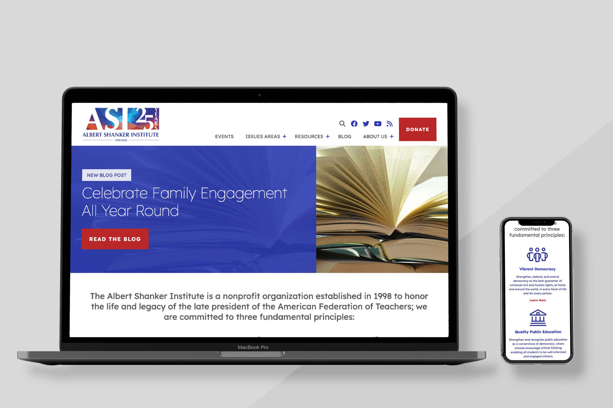
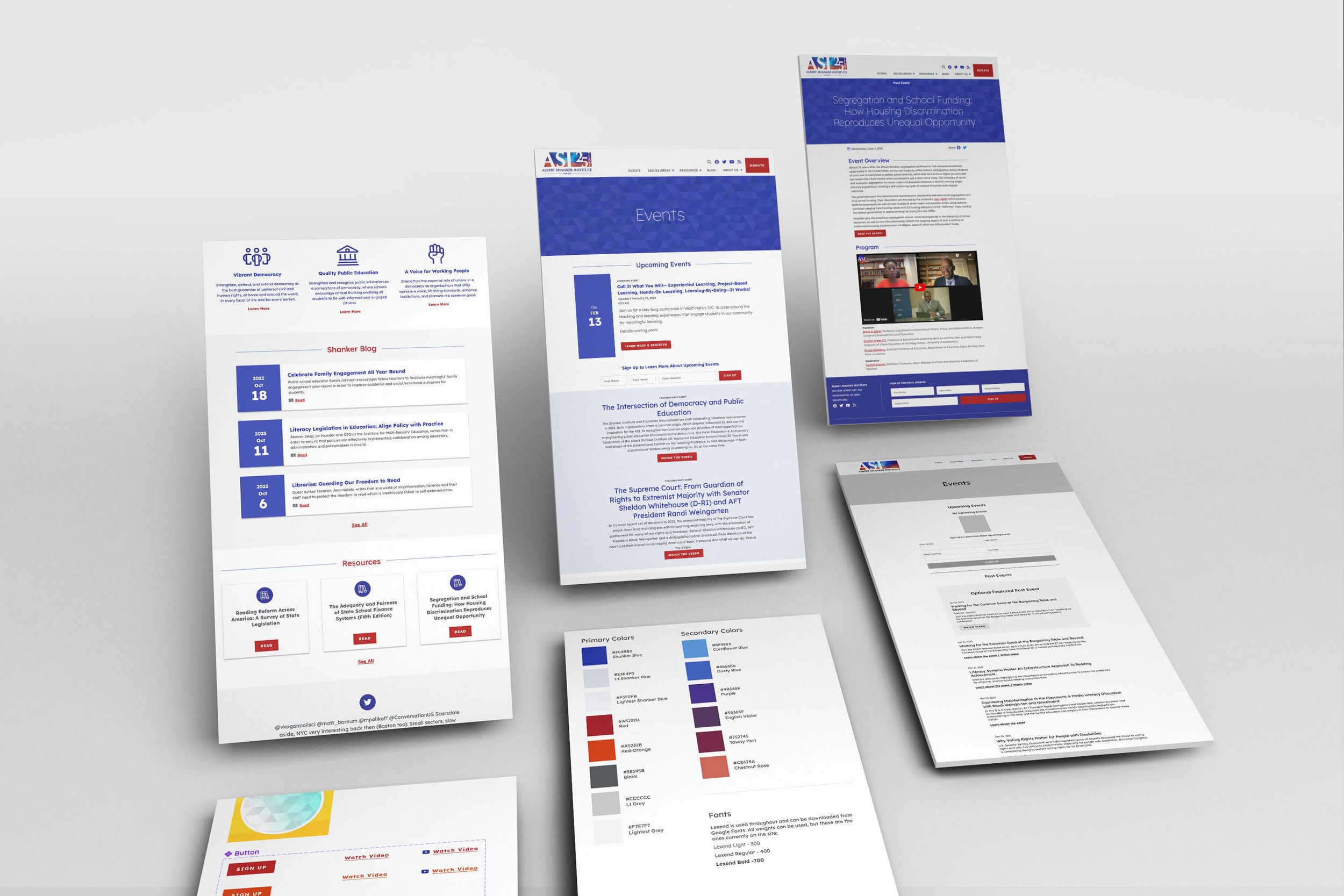
Albert Shanker Institute
The Albert Shanker Institute is a nonprofit organization established in 1998 that promote four foundational principles—vibrant democracy, quality public education, a voice for working people in decisions affecting their jobs and their lives, and free and open debate about all of these issues.
Work Produced: Website refresh, 25th anniversary logo, and print work
Problem: Client initially expressed dissatisfaction with their event pages, and noted a concern about future events appearing sparse. Also needed an updated system for better organization of content. After being happy with this initial work, they asked us to update the rest of their website and create other design work.
Solution: Overhauled their event section, consolidating past and future events within one page, with an ability to showcase a current and/or past event. Updated homepage to a more modern layout, with better defined user paths and a focus on blog posts. Client preferred to do a section by section update rather than one overall push.
Audience: Influential leaders and thinkers from business, labor, government, and education from across the political spectrum
Concept: Erudite ("to instruct, educate, cultivate")
Typeface Used: Lexend
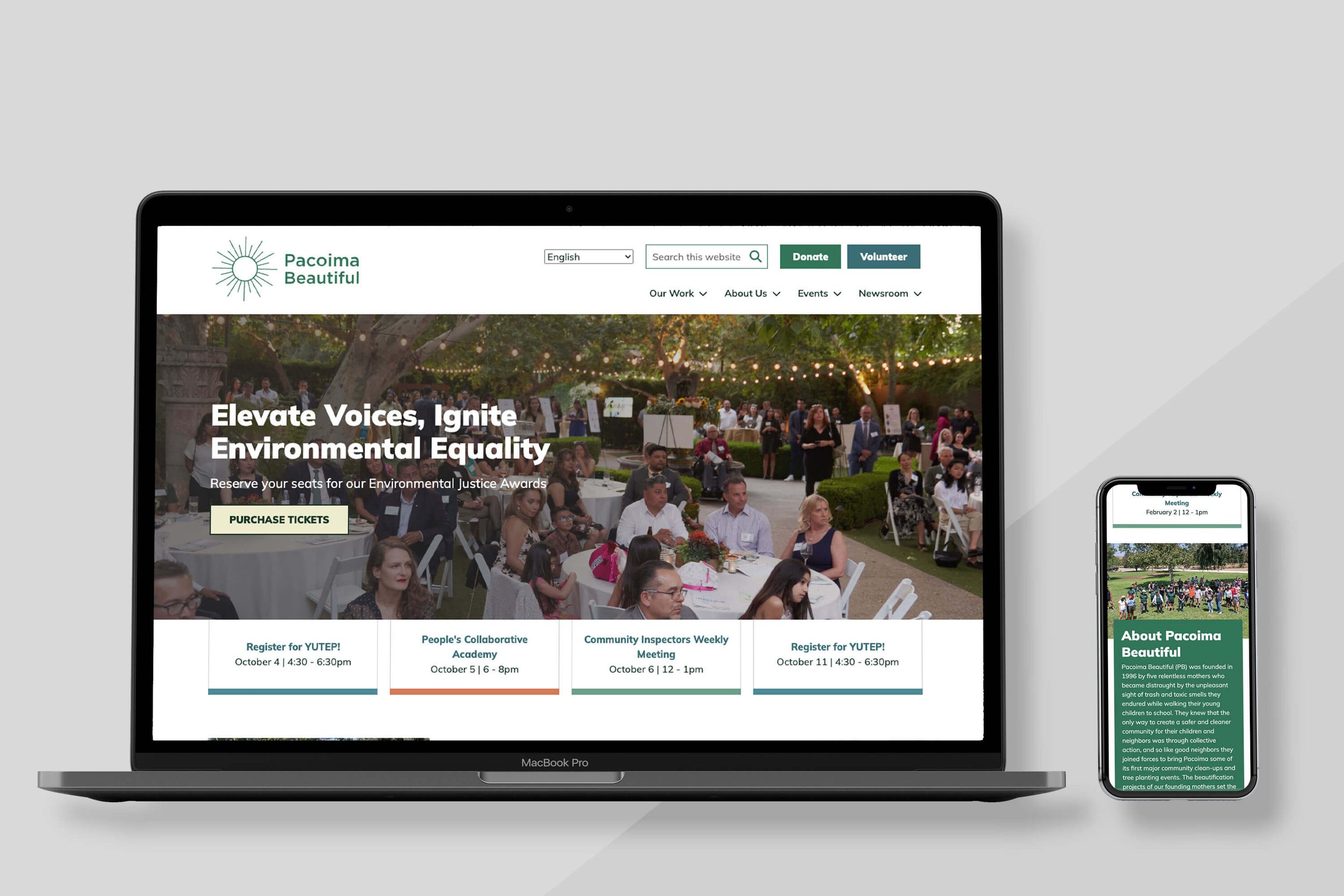
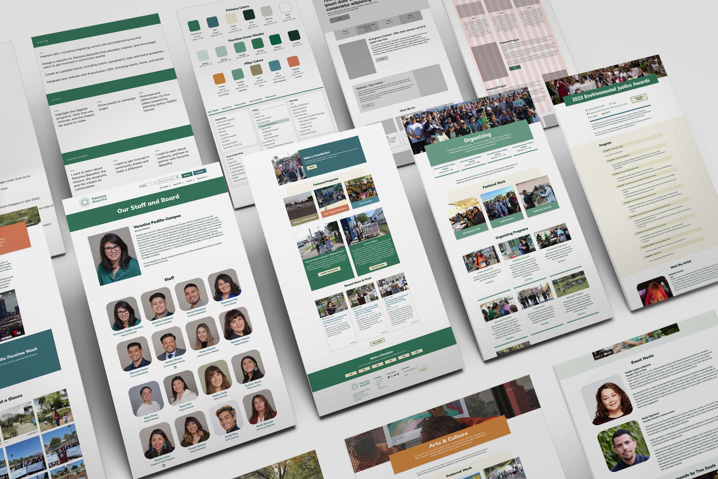
Pacoima Beautiful
Pacoima Beautiful is a grassroots environmental justice organization that provides education, impacts local policy, and supports local arts and culture in order to promote a healthy and sustainable San Fernando Valley.
Work Produced: Website rebuild and brand refresh with new logo
Problem: The client approached us seeking clarity and a more focused direction for their website, particularly in highlighting their impactful community initiatives. Despite being an active voice and partner in the neighborhood, their existing website failed to effectively convey this engagement. They expressed a need for a dedicated space where community members could easily discover upcoming events and explore opportunities for involvement.
Solution: Crafted a strategic homepage as a funnel, emphasizing flagship programs as primary navigation points and directing visitors to standalone campaign pages. Experimented with distinctive colors and fonts, aiming for a unique shade, specifically "Pacoima green," rather than a generic green. Prioritized themes of environmental justice, earth justice, and youth leadership.
Audience: San Fernando Valley community, policy makers, and advocates
Concept: Community and interconnectedness
Typeface Used: Mulish
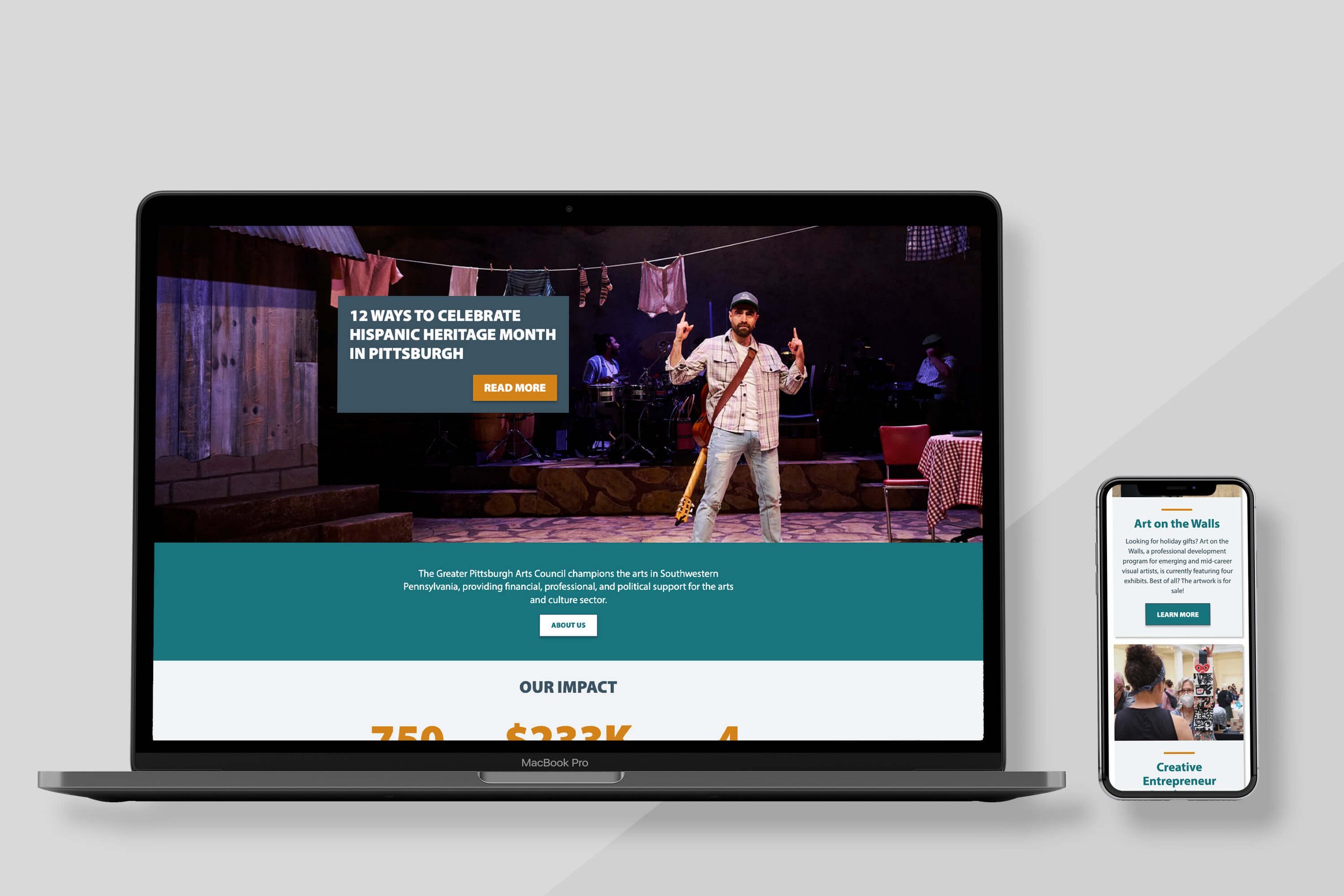
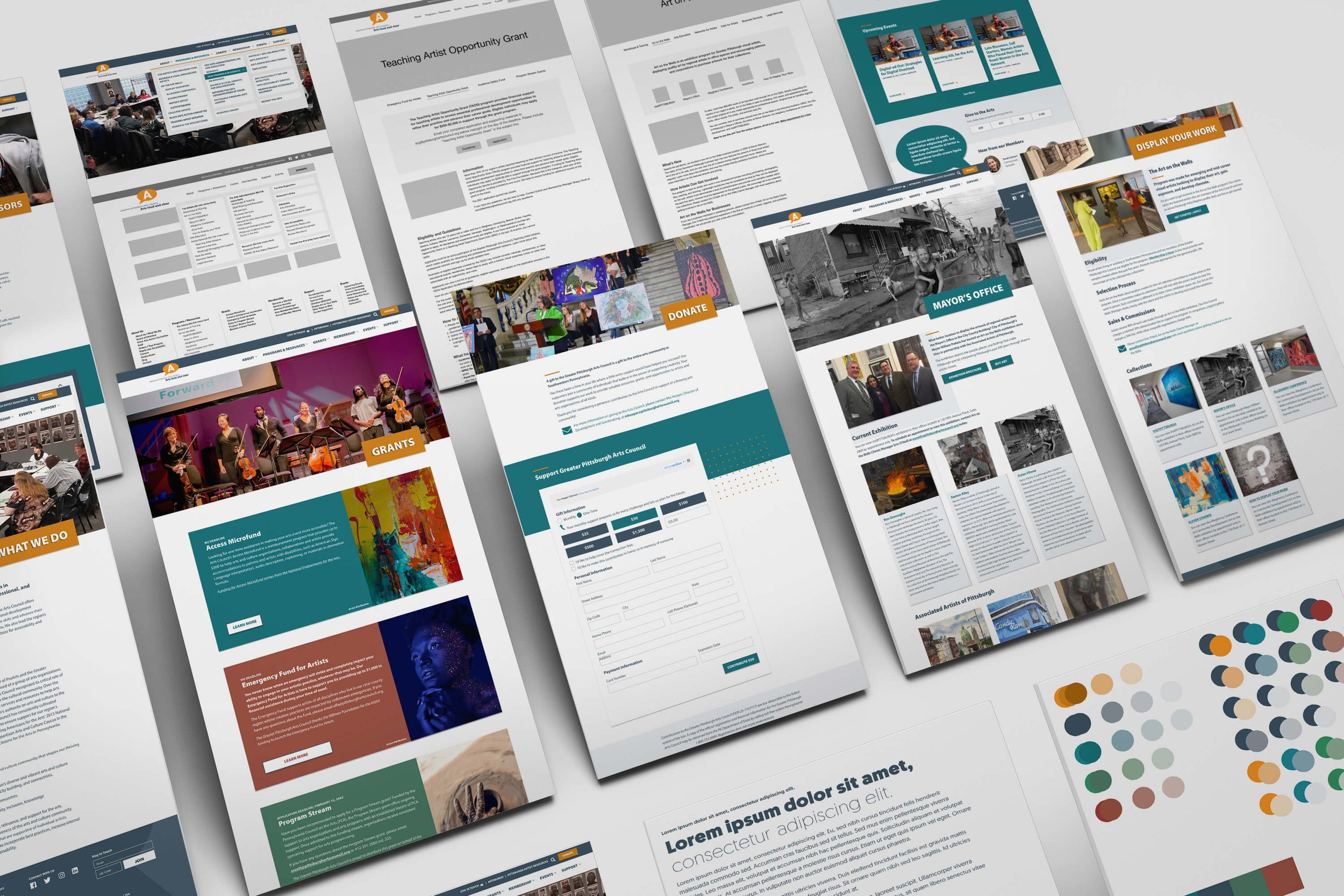
Greater Pittsburgh Art Council
The Greater Pittsburgh Art Council supports the time, talent, and work of artists, culture bearers, art educators, art workers, and arts organizations — reinforcing an environment so that ambitions, imagination, innovation, and risk taking can thrive in the Greater Pittsburgh Region.
Work Produced: Website rebuild
Problem: The client envisioned a comprehensive overhaul of their website, expressing dissatisfaction with the current static homepage, difficulties in finding buried content, and lack of intuitiveness for users. Citing a need for more engagement, they wanted to revamp the advocacy section, and make it easier to find resources on the site. All efforts needed to align with the established brand guidelines.
Solution: Transformed the website's navigation system, and introduced a more captivating homepage featuring distinct user pathways. Emphasized advocacy and grants within the top navigation, while also implementing a streamlined design for embedded forms to heighten user intuitiveness. Infused artistic and playful design elements throughout to enhance visual appeal.
Audience: Artists, arts administrators, donors/supporters, students, and government funders
Concept: n/a
Typeface Used: Myriad Pro
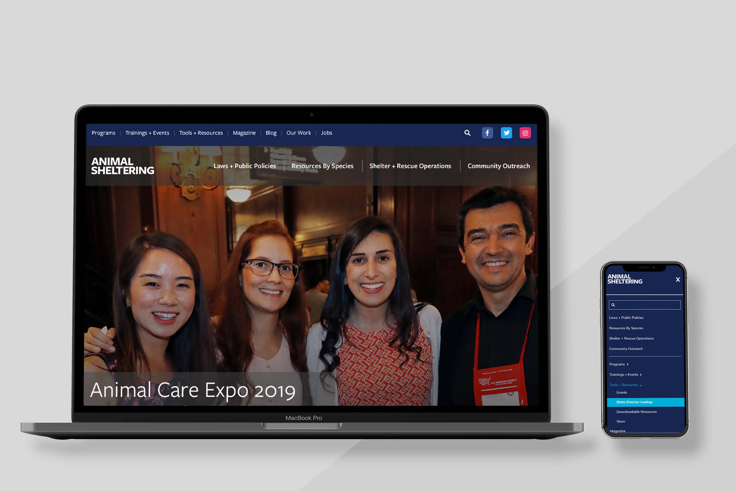
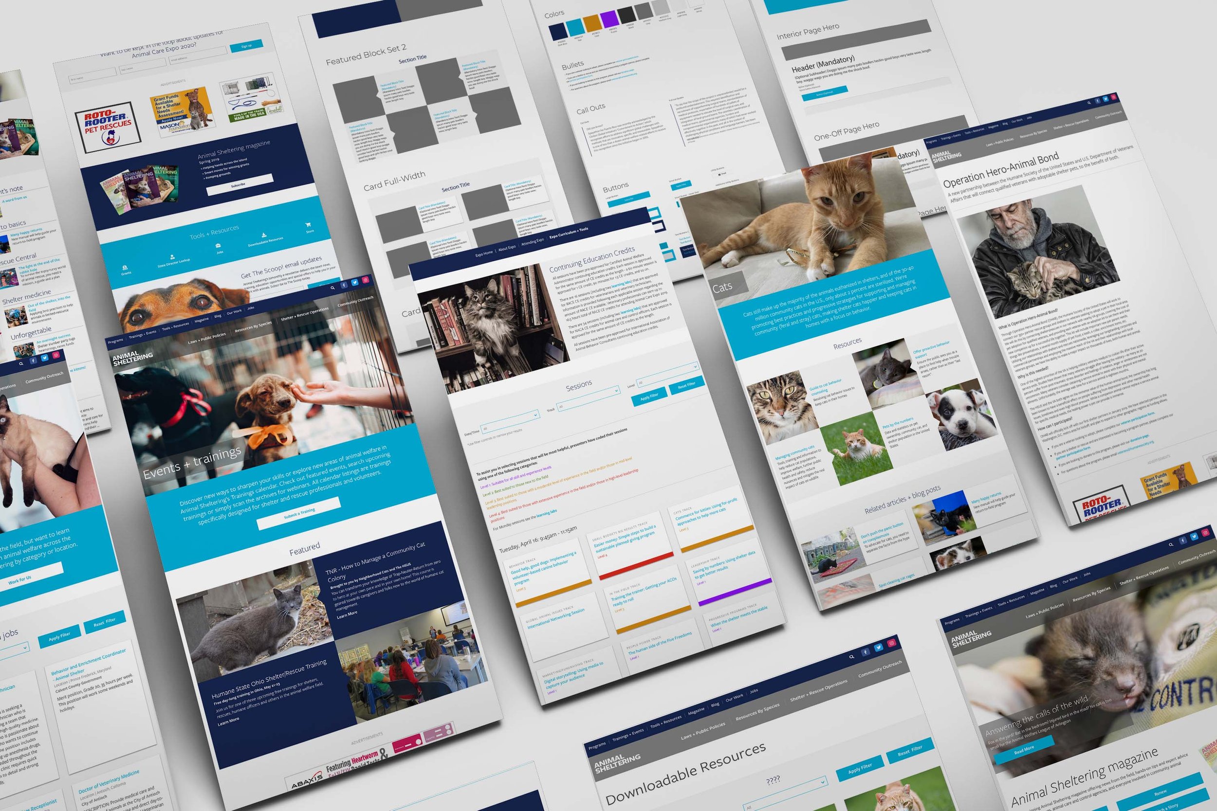
Humane Pro
Humane Pro, formerly known as the Animal Sheltering Organization, operates as a segment within the Humane Society of the United States. It serves as a dedicated source of valuable resources for organizations and individuals actively involved in working or volunteering with animals.
Work Produced: Website rebuild
Problem: The client expressed concerns about disorganization of their many pages and resources, an excessive number of tags, and confusing navigation on their platform. Additionally, they desired a more robust digital magazine section and a dedicated area for an annual expo. All efforts needed to align with the established brand guidelines.
Solution: Conducted a thorough overhaul of the navigation and site map, specifically breaking down the four main pillars to enhance accessibility. Introduced a secondary menu to highlight crucial information such as the magazine, resources, and events. Implemented visually appealing and diverse yet cohesive patterns to maintain interest across numerous pages and prevent monotony. Designed an extensive layout for the digital magazine and established an expo section with streamlined features for creating breakout sessions, offering resources, and indicating difficulty levels.
Audience: Groups that work or volunteer with animals, i.e. shelter staffer, rescue volunteer, animal services officer, veterinary professional, etc…
Concept: n/a
Typeface Used: Freight Sans Pro
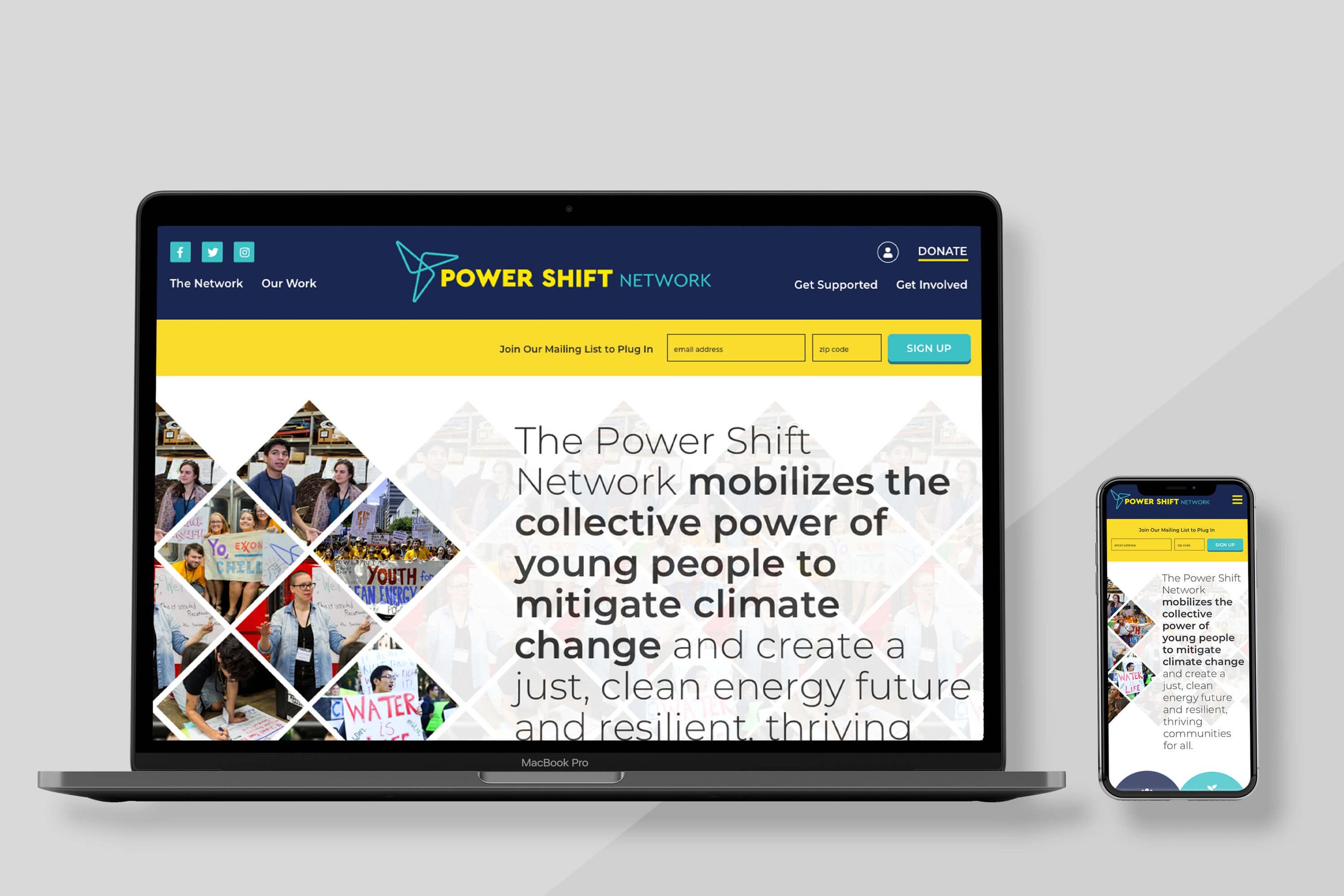
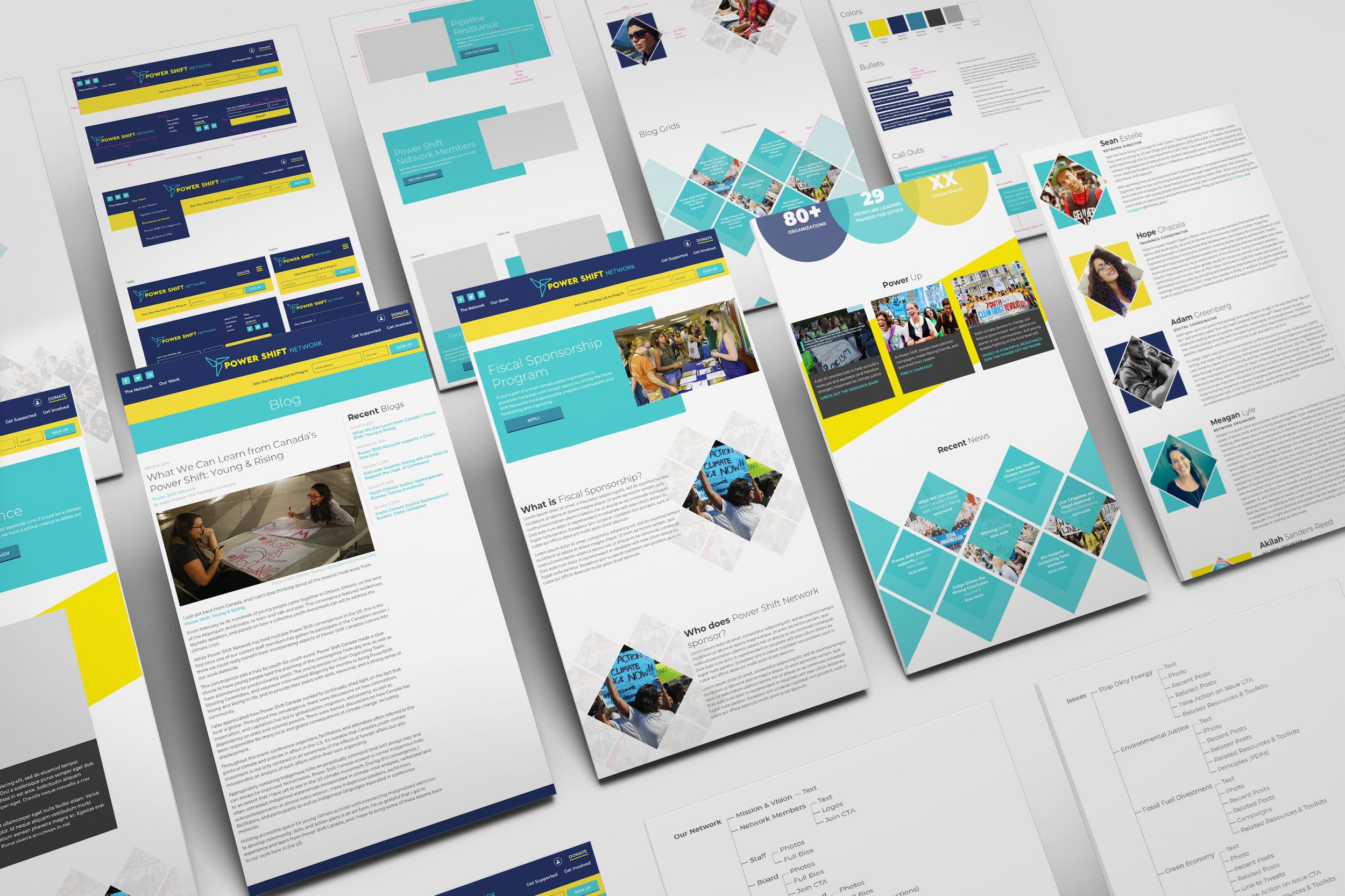
Power Shift Network
Power Shift Network mobilizes the collective power of young people to mitigate climate change and create a just, clean energy future and resilient, thriving communities for all.
Work Produced: Website rebuild
Problem: The client expresses dissatisfaction with the current outdated navigation, which fails to accurately reflect their present initiatives. They find the homepage lacking in substance and seek an overhaul that not only introduces new and clear user flows but also emphasizes a pivotal user action: becoming members and utilizing the tools provided. The goal is to inspire visitors to join this dynamic and activated network by modernizing the design and layout.
Solution: Introduced a redesigned site map, prioritizing ease of navigation for users to swiftly locate their desired content. Strategic user flows have been crafted and optimized, with a primary focus on enhancing engagement and encouraging individuals to actively join the network. The website now boasts an out-of-the-box layout and design, injecting dynamism and fostering a more engaging online environment. An expanded color palette, including an additional hue, has been implemented, accompanied by an updated font for a more approachable and modern aesthetic.
Audience: Young people wanting to make a difference in the world and climate change activists and organizations
Concept: n/a
Typeface Used: Montserrat