Selected Work
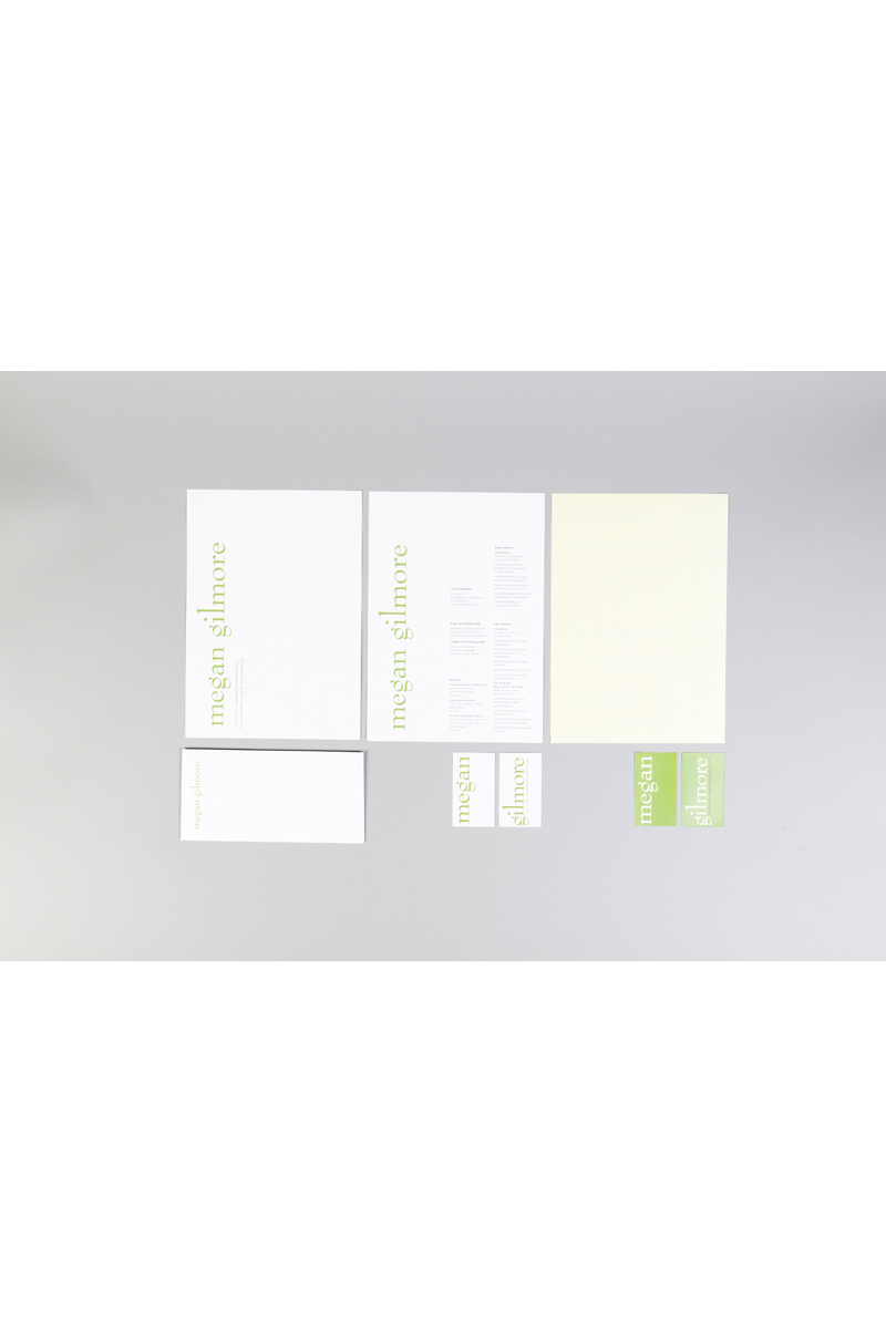
personal identity system
Dimensions of Piece
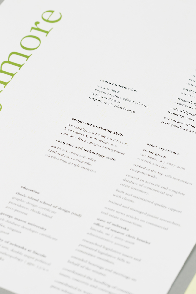
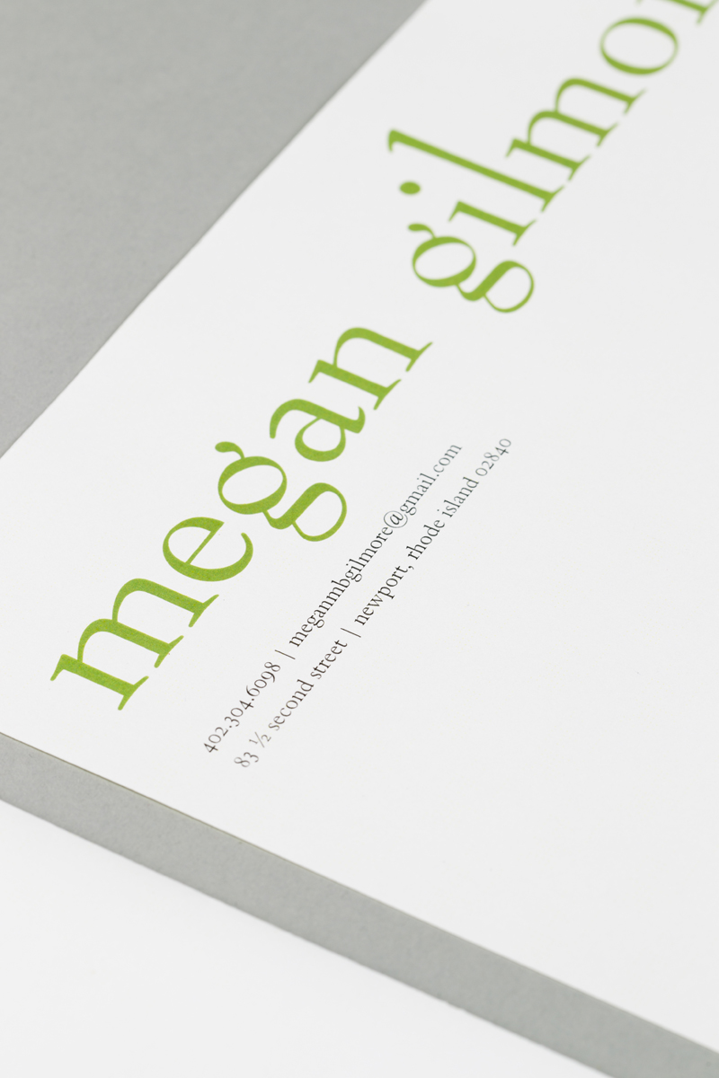
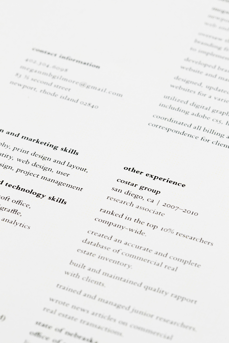
Resume, Stationary A4
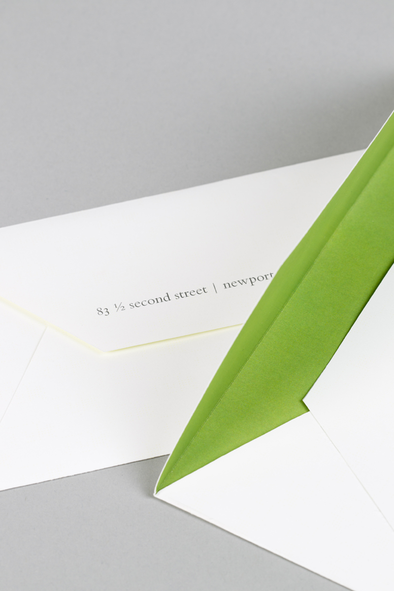
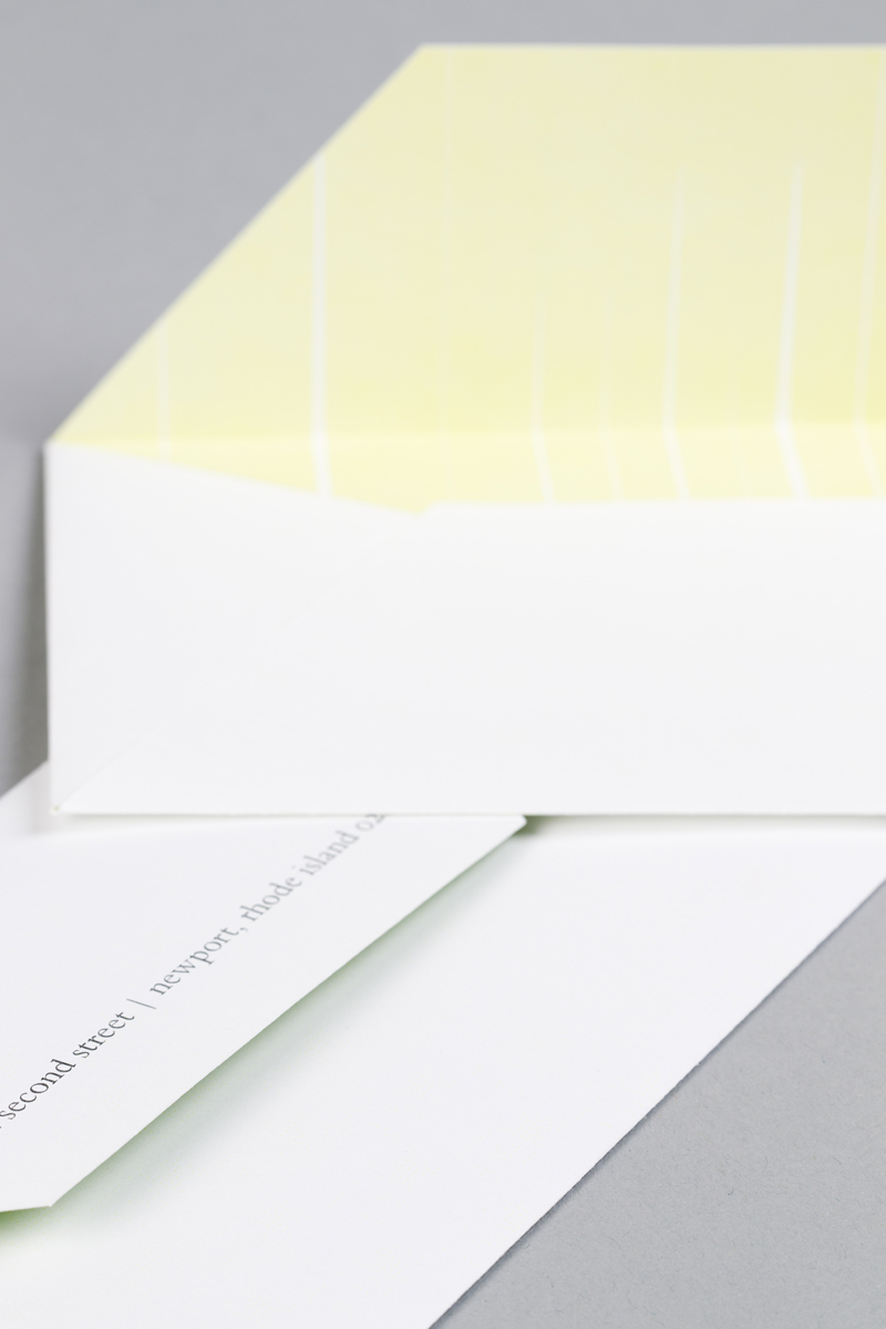
Envelope DL
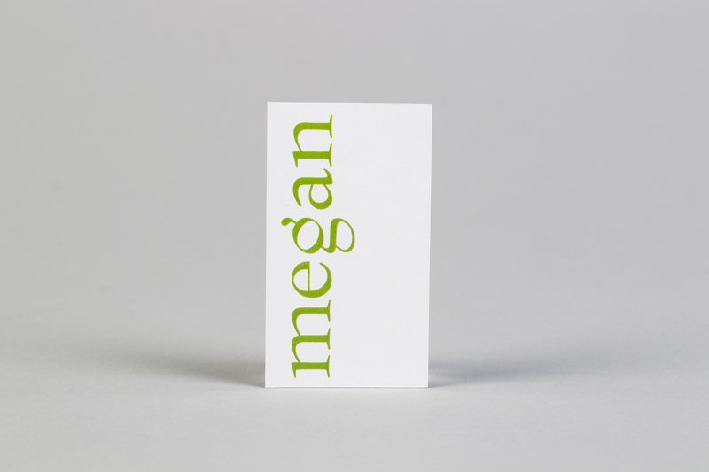
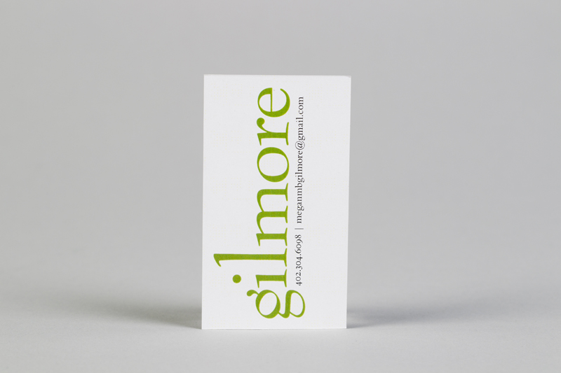
Business Card 2 x 4 inches
Description
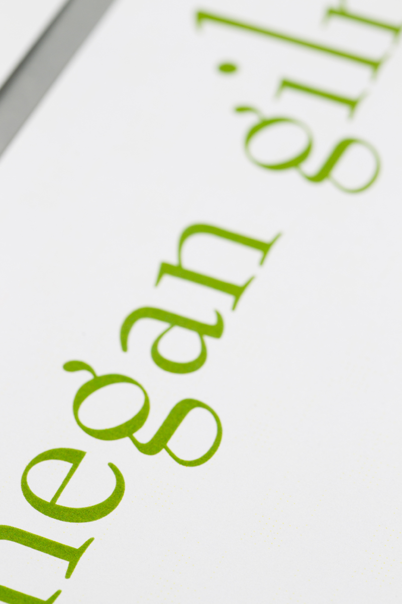
My personal identity was created in the Personal Identity Studio. My concept is Joy. The system consists of a resume, cover letter, stationary, business card and envelope. My wordmark is created with the typeface Bernhard Modern. The quirky tall ascenders and small descenders is unique and the flourish on the ‘g’ is in an upward, joyful motion. I carried on this upward motion for my layout. The wordmark is placed vertically, and the columns of copy reach toward the top of the page. The proportion of my resume and stationary is A4. This allows for more vertical space. I chose the color green for my wordmark to continue with this light feeling. The backside of my paper has vertical white lines with a green background. The typeface chosen for the copy was Bembo because of the similarity in x-height and structure it has with Bernhard Modern.
Concept | Joy
Typeface | Bernhard Modern and Bembo
Paper | Color Xpression Elite, white; Resume, Stationary, Envelope-70 text Business Card-60 cover
Printer | ConceptLink
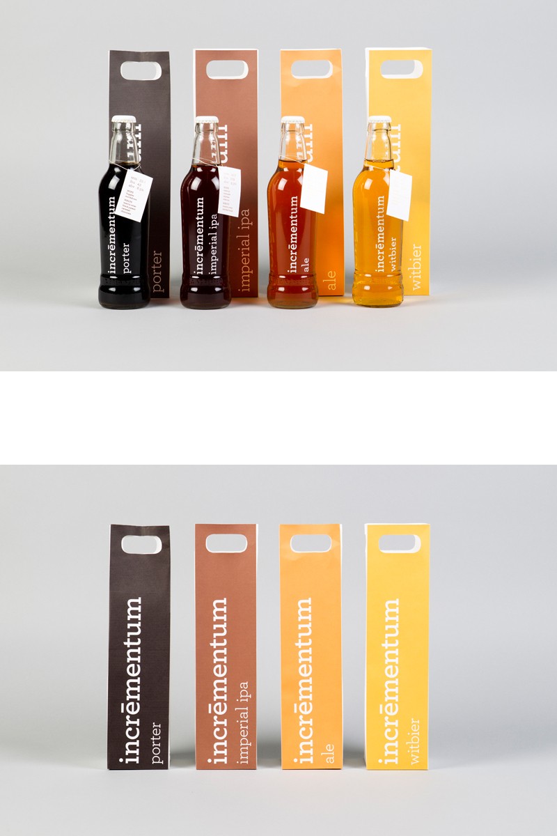
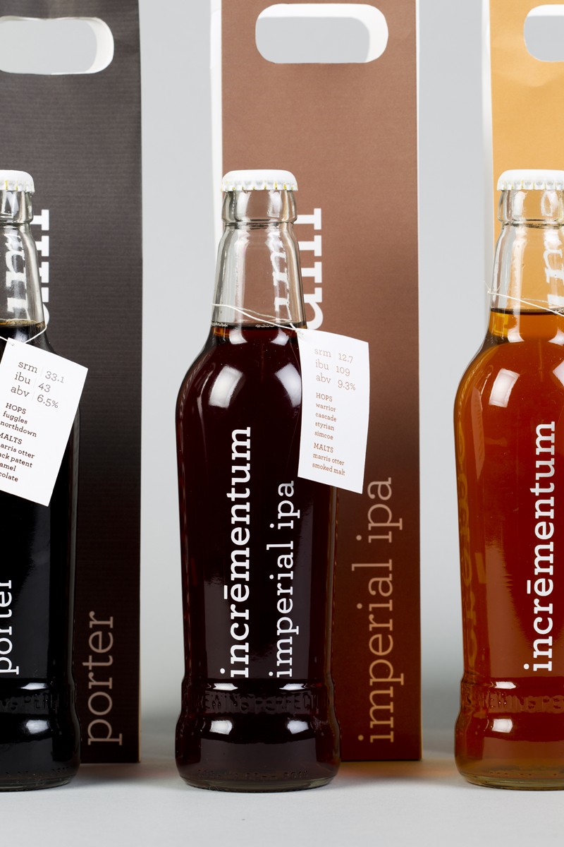
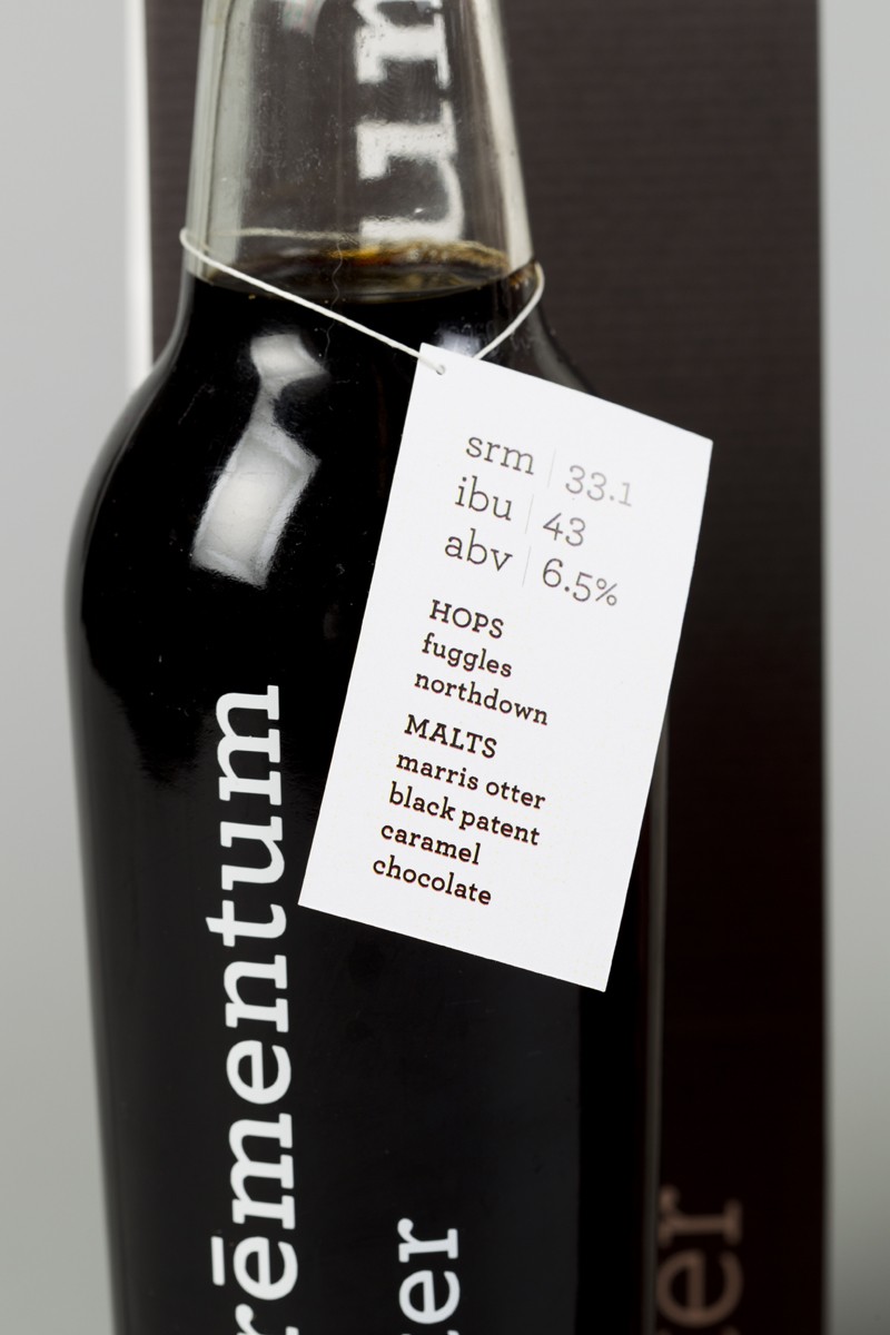
identity and package design for incrementum brewery
Dimensions of Piece
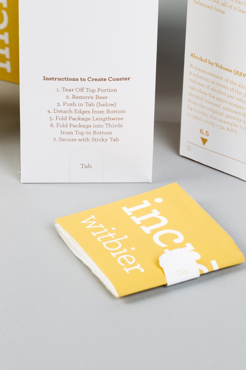
Package 3 x 3 x 15 inches
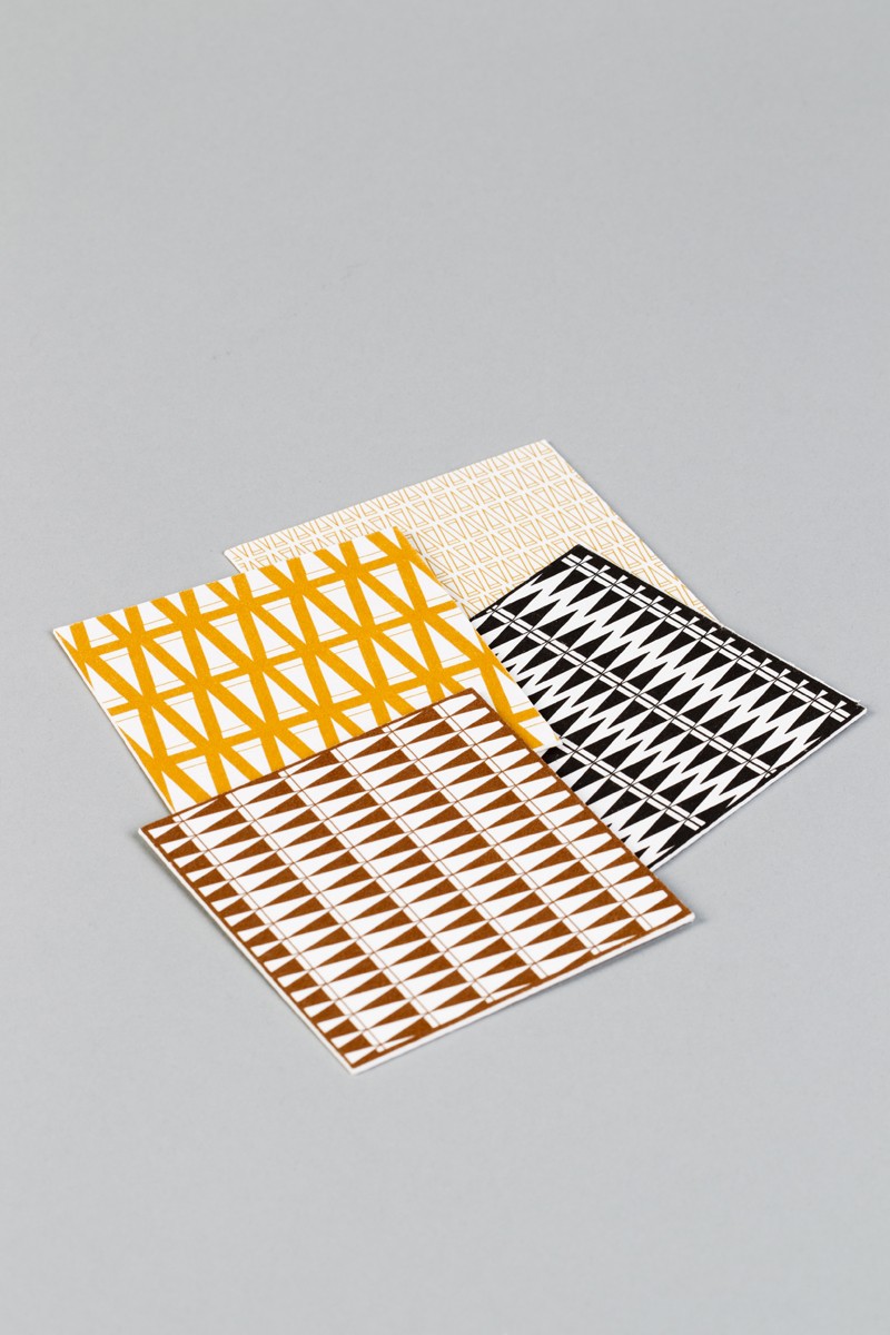
Coaster 4 x 4 inches
Description
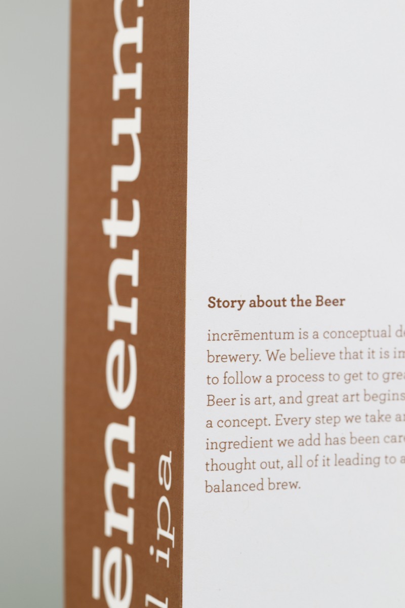
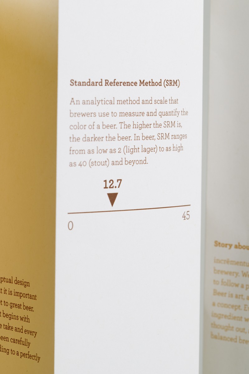
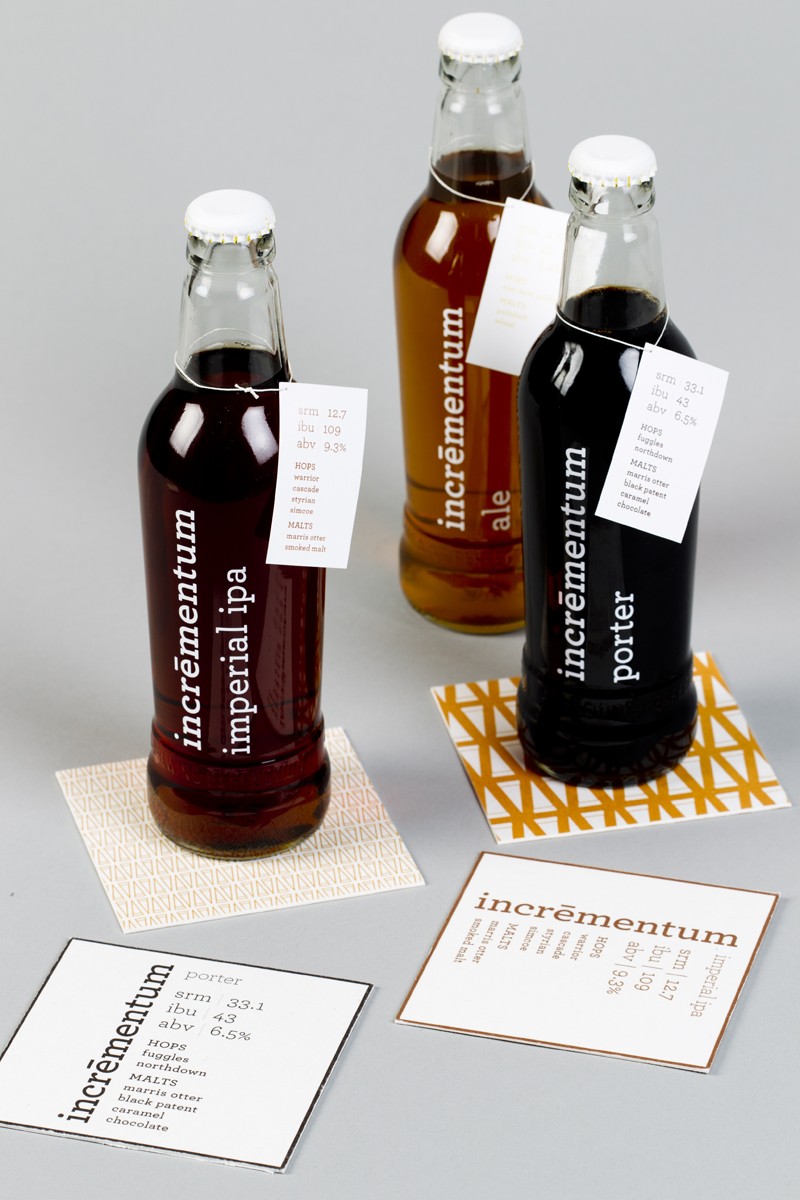
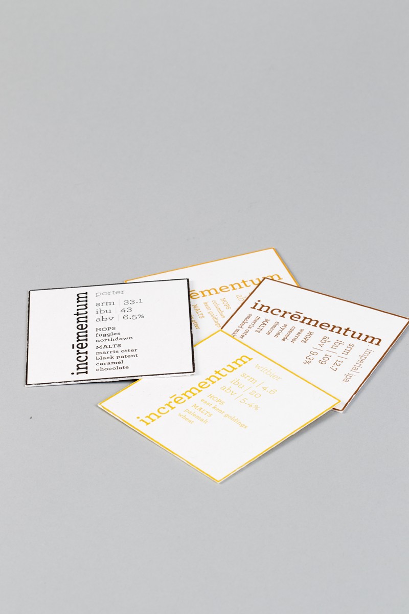
Created during Final Studio, this project’s objective was to create a label and package design for a beverage company. I chose a fictitious brewery, Incrementum Brewery. The concept I chose was Increment. This refers to the steps taken to create beer—ingredients added one by one, in a specific order to brew a variety of beers. It also refers to the increment of color. The color is based on the type and amount of malt added, and is measured by SRM (standard reference method). The labels created are for a witbier, an ale, an IPA and a porter. I chose these specific styles to show a range of colors and styles. The package can be re-purposed into a coaster, following an incremental step-by-step process. The typeface is Archer, which is a nice compromise between a rhythmic serif/flourishes, demonstrating increment; and is consistent in stroke width, which gives the look of mathematical precision.
Concept | Increment
Typeface | Archer
Paper | Package-Neenah Environment PC 100 White, 80 text weight Tabs-Neenah Environment 100 lb. dull cover Coasters-Neenah Blotter Lightweight Labels-Vinyl
Printer | ConceptLink

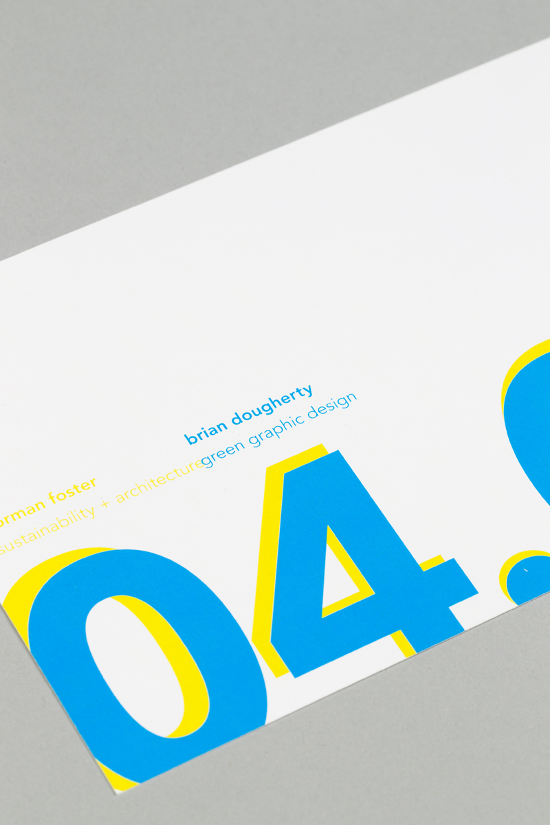
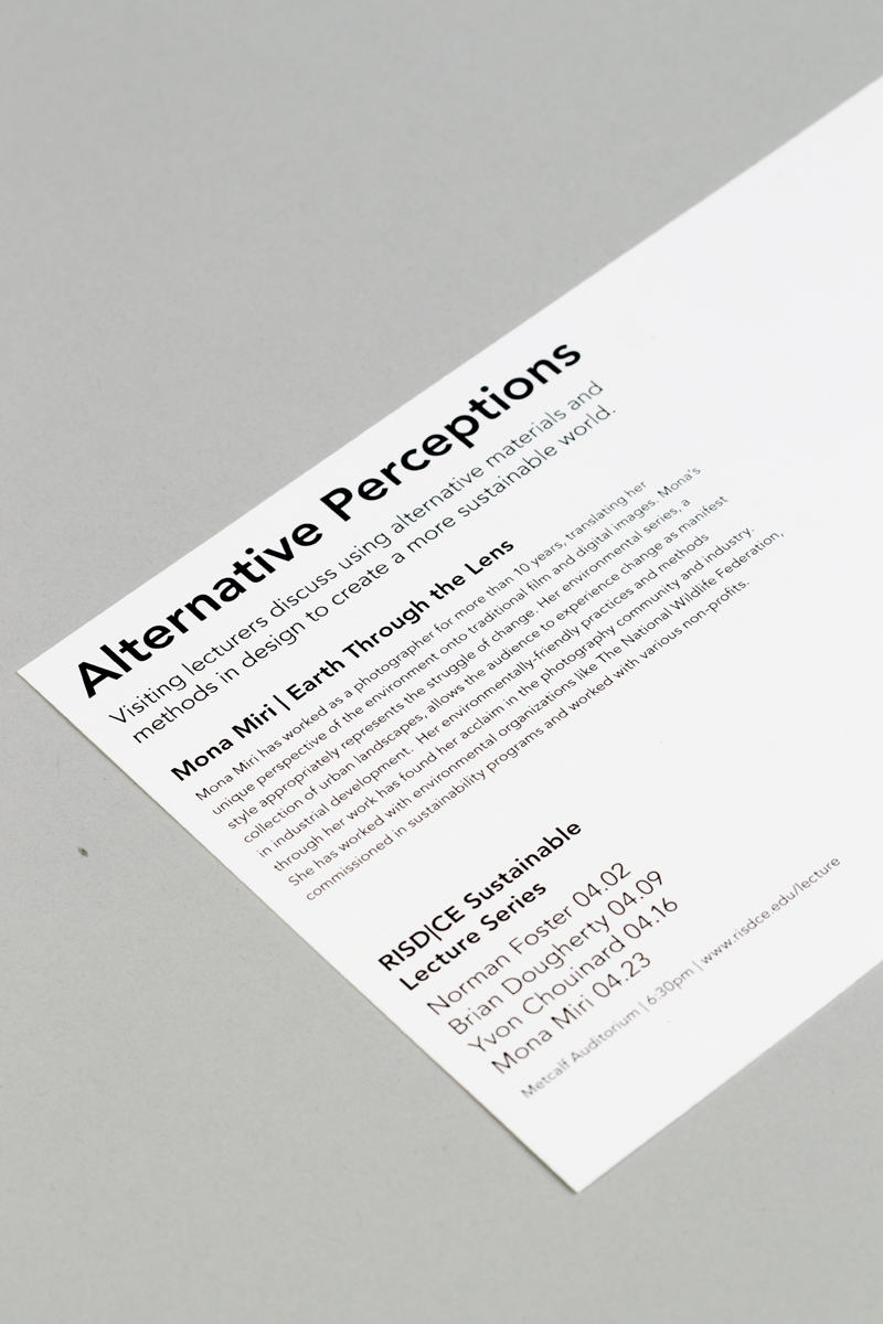
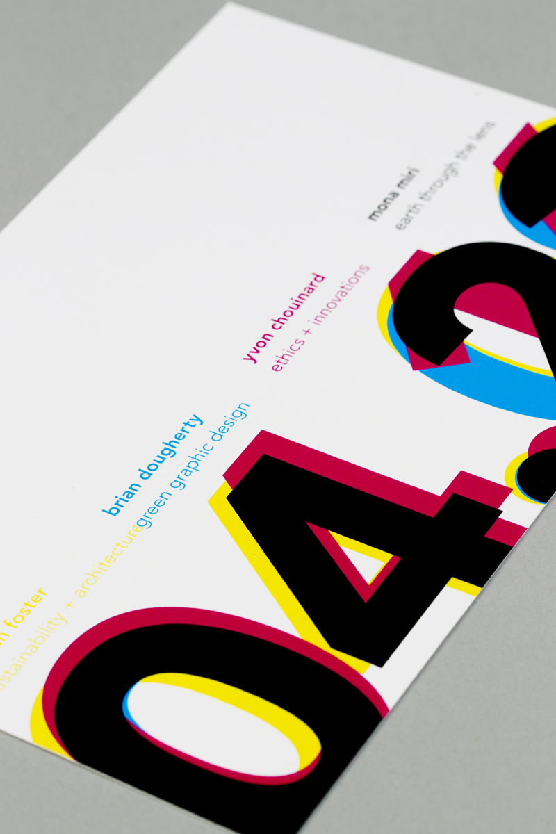
ce visiting lecture series - alternative perceptions
Dimensions of Piece
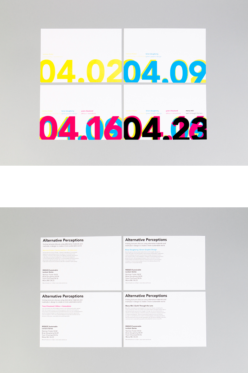
4 cards, each 6 x 9 inches
Description
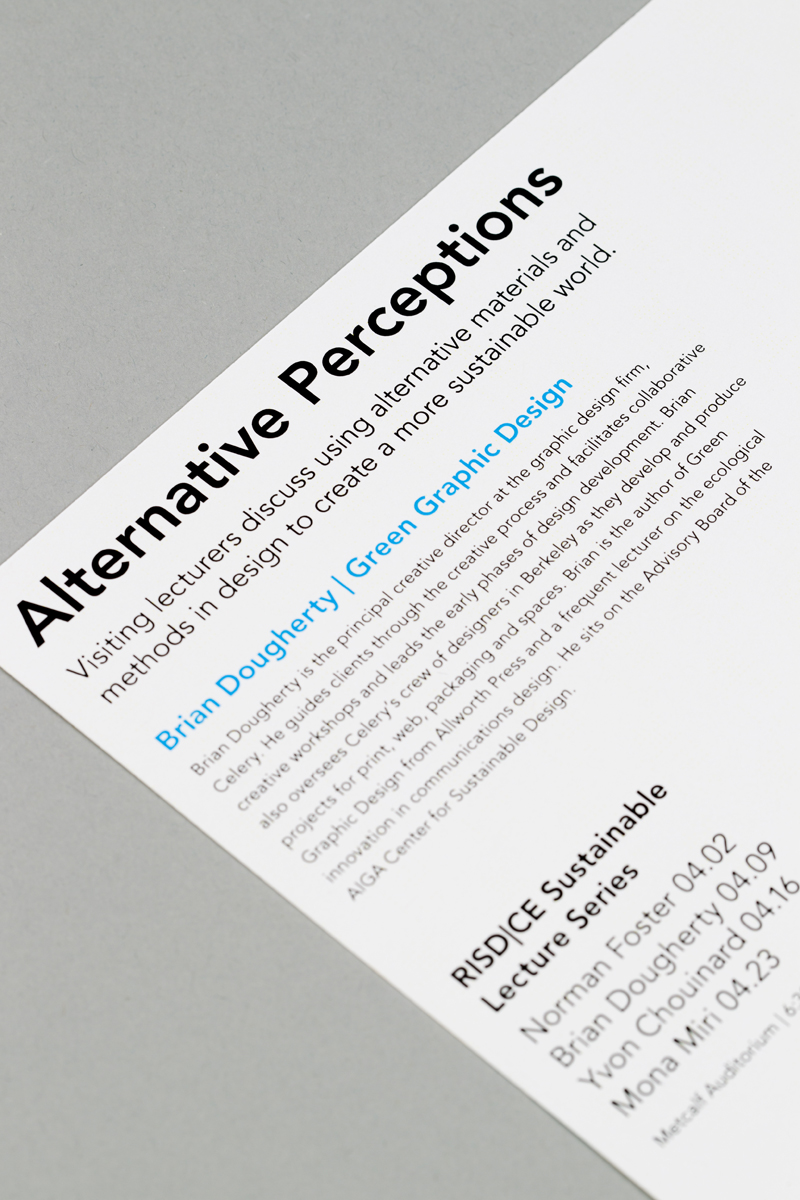
This piece began its journey in the class Thinking Visually and was created in Final Studio. The objective was to create a marketing piece for a four-part visiting lecture series with a time frame of two days until print, and a budget of $2,000. The lecture series is entitled Alternative Perceptions, and is comprised of four artists who all use sustainable practices. My concept for this piece is perception. Everyone has different viewpoints and preconceptions. However, it is important to be able to see things from another perspective. These artists take materials or images often perceived as ugly, useless or trash and create something inventive and beautiful. The idea behind the mailer postcards is that each artist is reprinted over the previous one, re-purposing the piece as something useful instead of throwing it into the trash.
Concept | Perception
Typeface | Avenir
Paper | Neenah Environmental PC 100 White, 80 cover weight, which is created from 100% post consumer waste
Printer | ConceptLink

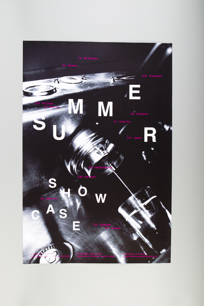
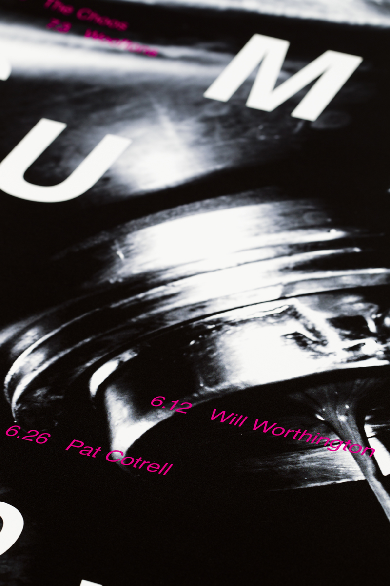
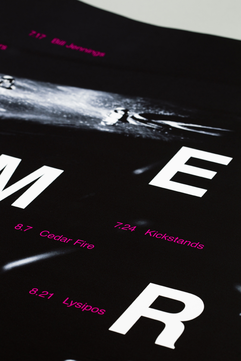
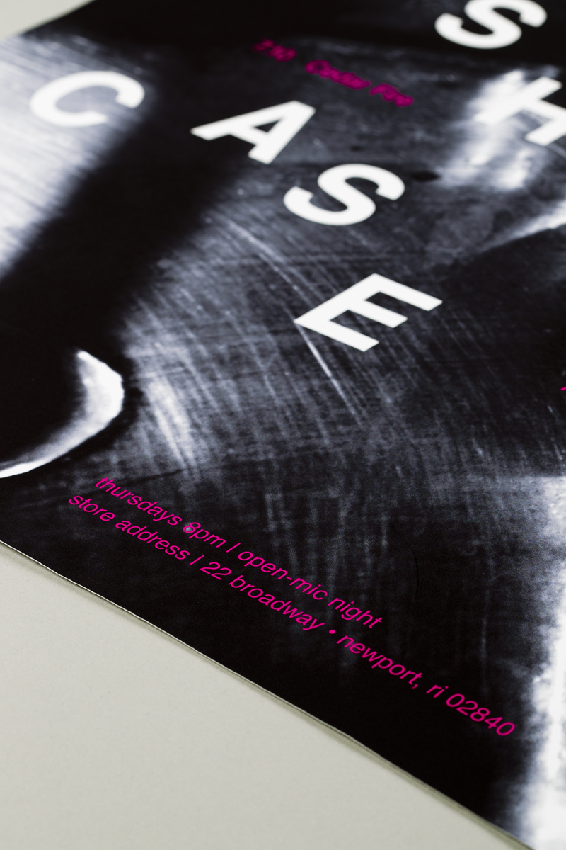
empire tea and coffee summer entertainment series
Dimensions of Piece
25 x 36 inches
Description
This poster was created for the class, Poster Studio, and was completed during Final Studio. It is a poster advertising for the summer events that take place at the Newport, Rhode Island cafe, Empire Tea and Coffee. Loose leaf tea was the inspiration behind the type layout. I focused on loose tea leaves because it represents the local, independent vibe versus the corporate feel of packaged tea bags. The chosen typeface, Helvetica, is simple to offset the complexity of the random type structure and image.
Concept | Independent
Typeface | Helvetica
Paper | Océ Photomatte
Printer | ConceptLink