envision unlimited
Rethinking a complex human-services website eight years after our first collaboration.
Description
I first designed for Envision Unlimited seven years ago. In 2026, the organization returned to our team for a complete re-architecture, redesign, and rebuild—giving me the unusual opportunity to rethink an experience I had helped shape earlier in my career through the lens of everything I had learned since.
As the sole designer on the project, I worked from early discovery and information architecture through visual design, responsive behavior, accessibility, reusable patterns, and developer handoff. The challenge wasn't simply to modernize the website: it was to make a large and complex organization easier to understand for people arriving with very different needs.
Work Produced
UX/UI Design | Information Architecture | Responsive Design | Accessibility | Design System | Developer Handoff
Tools
Figma | ChatGPT
Seven Years Later
Envision Unlimited serves people with intellectual, developmental, and mental health disabilities across a broad range of programs and services. Over time, the organization's website had grown alongside it, accumulating content and complexity that made it harder for visitors to understand what Envision offered and where to begin.
The redesign gave us an opportunity to reconsider the experience from the ground up.
Rather than treating the existing site as a visual template to refresh, I looked at how its content could be reorganized around the people using it: individuals seeking services, families and caregivers, referral partners, donors, and others trying to understand or support Envision's work.
I also used ChatGPT as a brainstorming partner during the process—helping me explore ways of organizing complex information and pressure-test early ideas. AI supported the exploration, but the architecture and design decisions remained grounded in project requirements, stakeholder conversations, and my own evaluation of what would create the clearest experience.
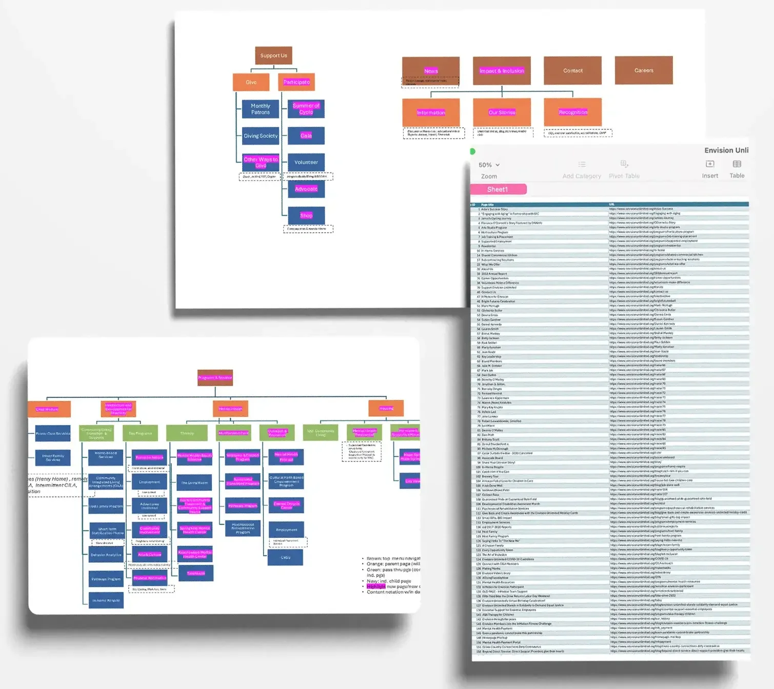
Untangling the Information Architecture
One of the largest challenges was simply making the organization understandable.
Envision offers services across intellectual and developmental disabilities, mental health, housing, child welfare, and other areas. Organizing the site around the organization's internal structure would have been easier—but it wouldn't necessarily match how someone unfamiliar with Envision would look for help.
I reorganized the experience into clearer service areas and kept the primary navigation intentionally shallow, using structured landing pages to handle complexity rather than pushing visitors through increasingly deep menus.
The goal was to create predictable pathways: help people understand where they were, what was available to them, and where they could go next without needing to understand Envision's organizational structure first.
Designing for Clarity and Accessibility
For a human-services organization, accessibility couldn't be something checked at the end of the project. It needed to influence the structure of the experience itself.
That meant considering more than color contrast and type size. I focused on plain language, predictable navigation, clear heading hierarchy, visible interaction states, generous content spacing, and patterns that reduced cognitive load.
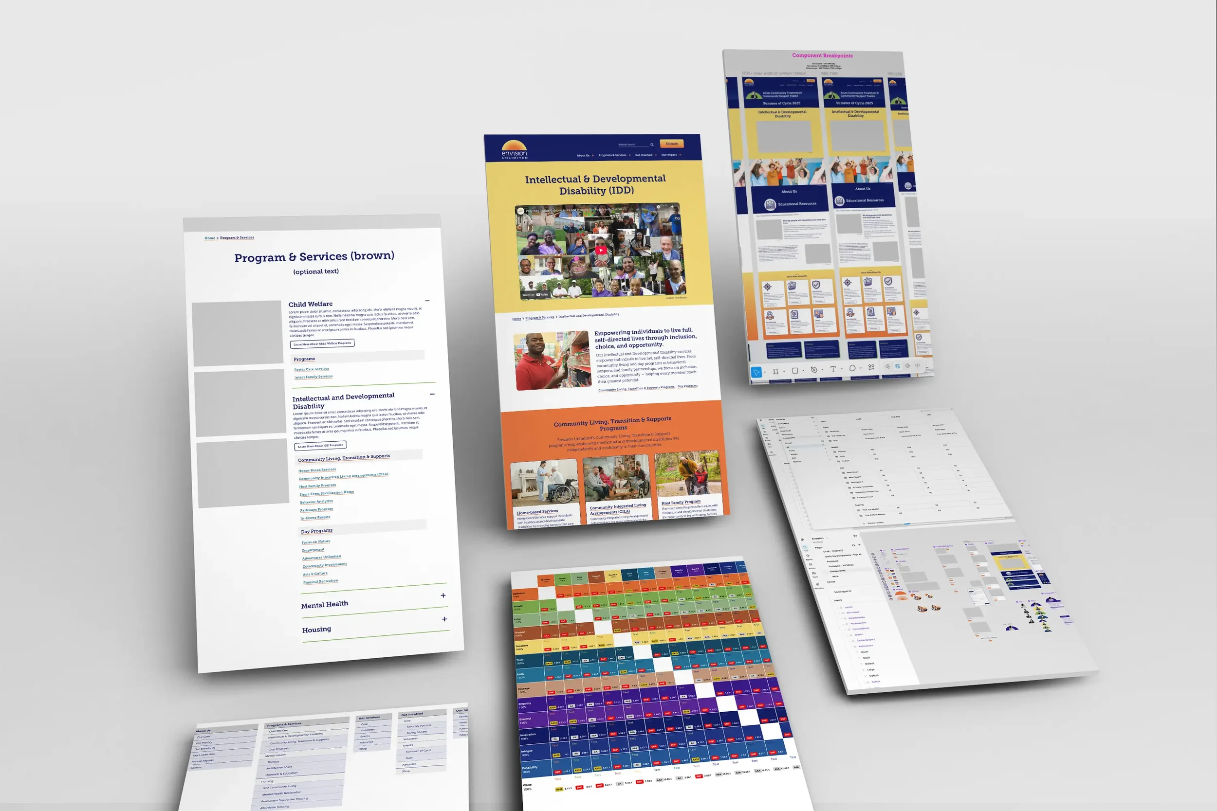
The site's four primary service areas each use a distinct color, but color is never the only way a visitor can identify where they are. Breadcrumbs reinforce location throughout the experience, while custom graphics—created using Envision members as models, with their permission—give each service area its own recognizable visual identity.
After development, Envision engaged an independent accessibility testing company to evaluate the completed site. The site performed strongly overall, with only a small number of adjustments identified through testing and incorporated before completion.
Program and service pages use reusable structures and components that accommodate a large amount of content while giving visitors a consistent mental model as they move through the site.
From System to Experience
The final designs translate that architecture into a responsive visual system that feels warm, human, and approachable while still supporting the credibility required of a large service organization.
Reusable components establish consistency across programs, resources, stories, and calls to action, while flexible page structures allow different kinds of content to retain their own character. Responsive behavior, component states, and implementation considerations were defined as part of the design rather than left as decisions for development.
Throughout the process, I worked closely with our developers to balance the intended experience with the realities of implementation—continuing the collaborative design-to-development process our small team has refined across years of client work.
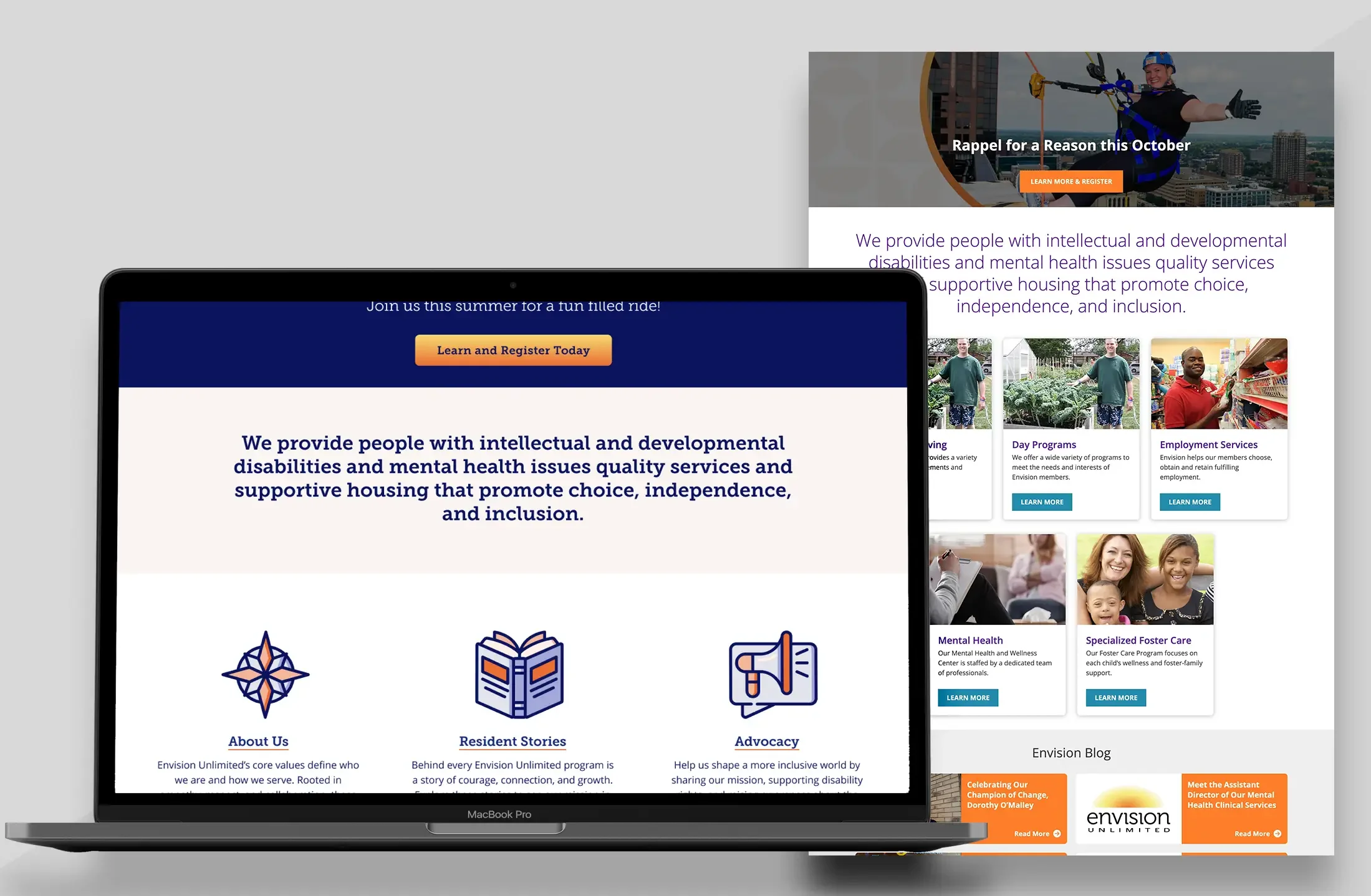
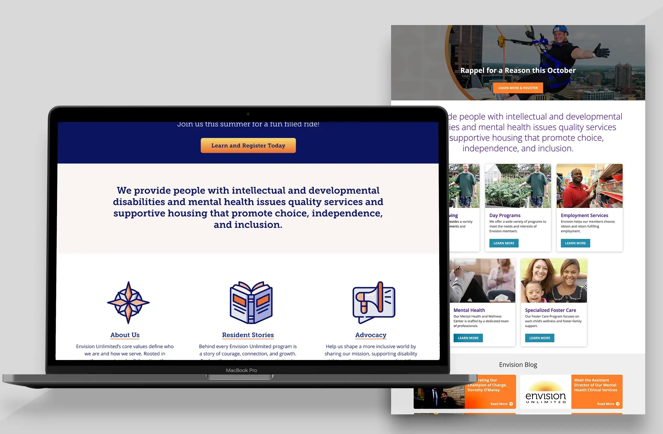
A Different Kind of Before and After
What I like most about this project is that the “before” isn't somebody else's bad design.
It's mine.
I designed for Envision seven years ago, and I'm still proud of the work we created for its time. Returning to the same organization years later offered a rare opportunity to see how both its needs and my own approach to design had evolved.
The earlier project reflects where I began: strong visual design and clear digital experiences. The new Envision reflects how I work today—starting with users and structure, building reusable systems, considering accessibility throughout the process, and designing with implementation in mind.
The relationship evolved, too. Seven years after our first project together, Envision trusted our team to rethink its digital experience again.